Tucked away within an industrial complex in Norwalk, Connecticut, a versatile culinary center manages to be light and inviting—despite its location inside a large facility and the many programmatic functions it serves. Abruzzo Bodziak Architects (ABA) was challenged with designing the new space for On The Marc Events. The eventing and cooking company wanted this project to be referred to as the “happiness project,” asking ABA to completely transform the underutilized space into a warm and welcoming workplace to lure current employees and potential prospects back post-pandemic.
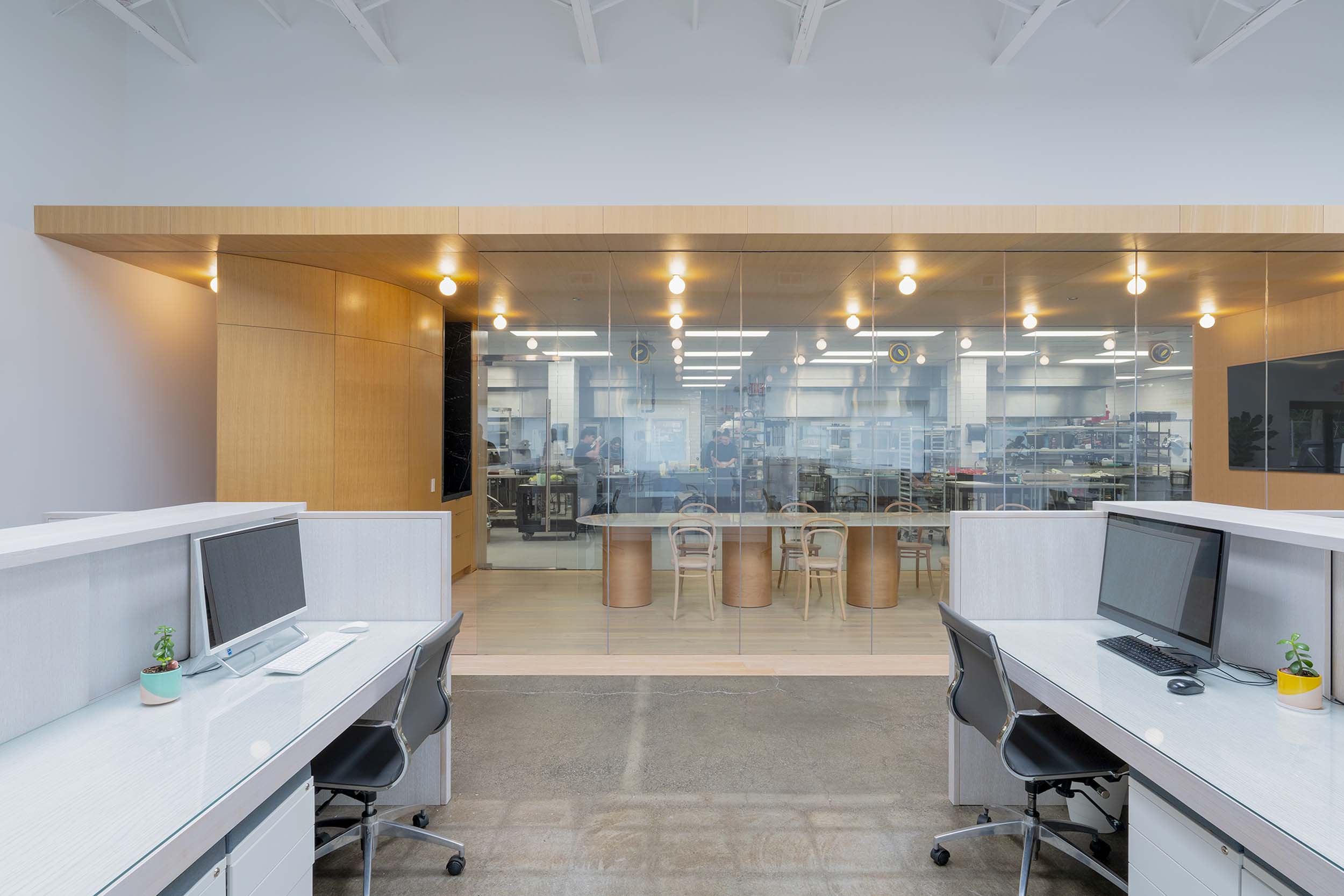
ABA took a radical but strategic approach to carving out the 15,020-square-foot space to benefit all functions involved. Coined the Tasting Rooms, the project is divided into three main compartments: an office filled with natural light, a fully functioning kitchen, and two tasting rooms sandwiched between them. Although there are several moving parts, it lacks an overwhelmingly busy atmosphere due to the material application and approach to light within each of the spaces. Emily Abruzzo, ABA’s cofounder, shared with AN Interior, “We focused on bringing in natural light through industrial-sized skylights as well as new windows, visually connecting the kitchen and office sides of the building so that the whole space would feel larger and more open while providing social connectivity, and using materials with color and texture.”
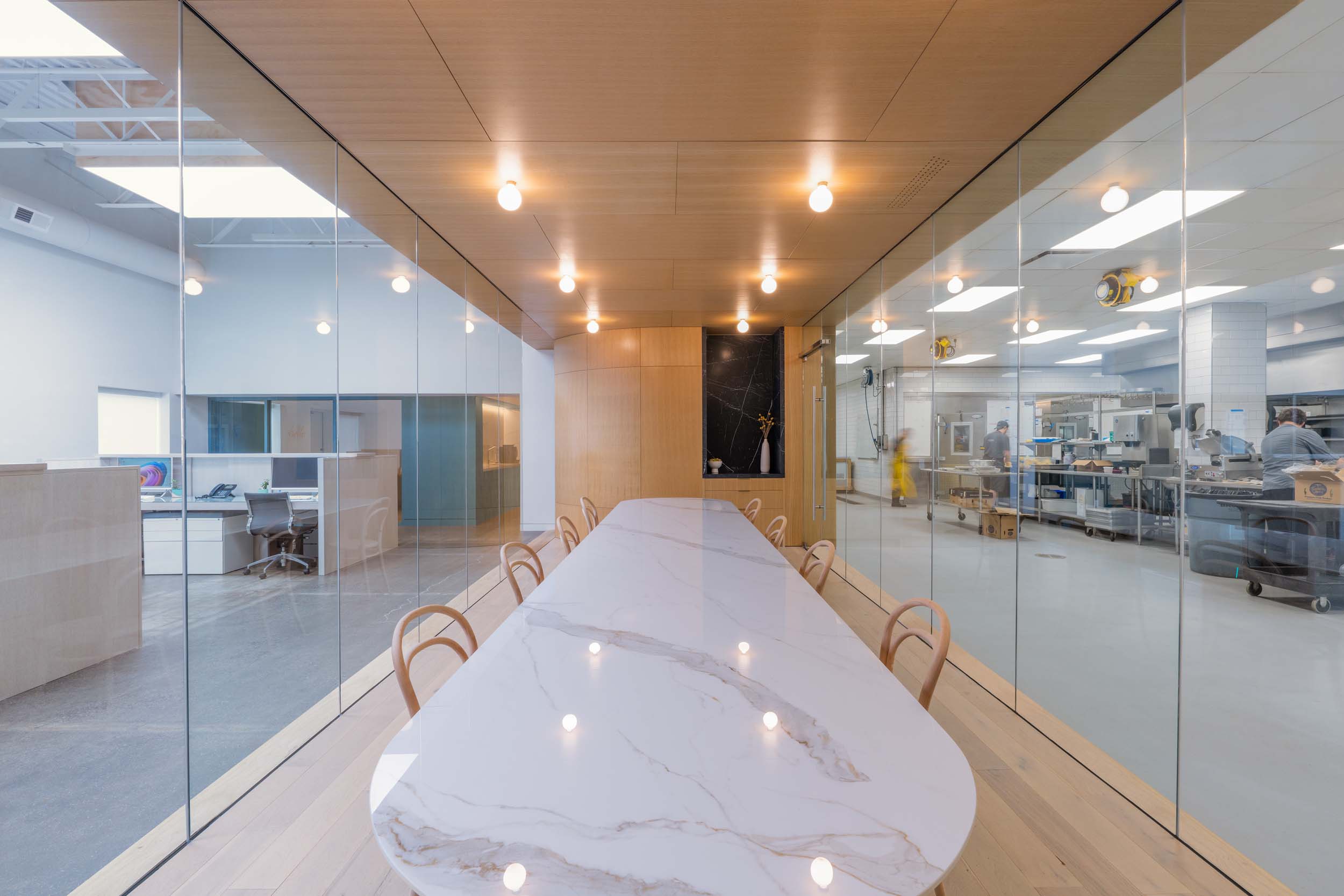
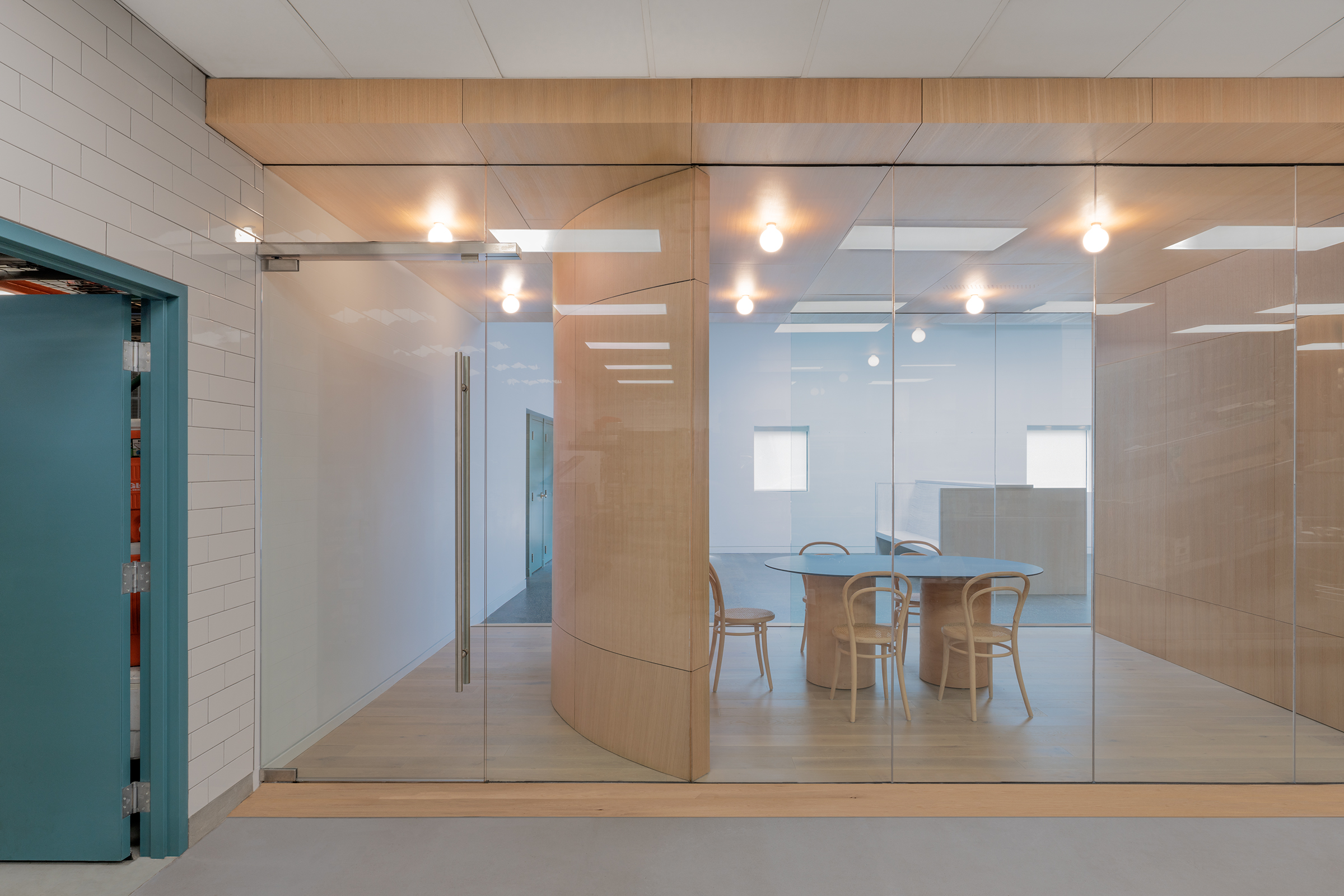
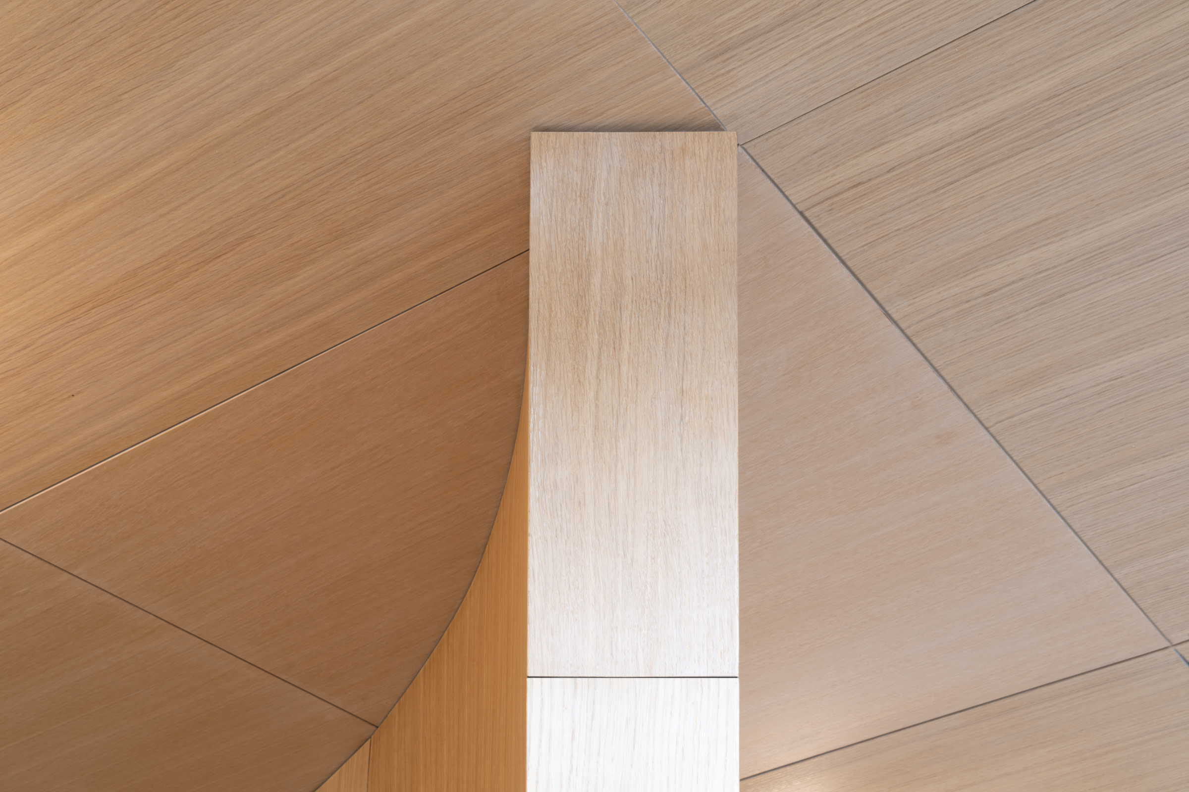
From one side of Tasting Rooms to the other, a balance between cool and warm materials is apparent. The professional kitchen is drenched with stainless steel appliances and clean, white subway tile walls. The two central tasting rooms are wrapped in warm white oak met with floor-to-ceiling glass walls, offering transparency between all three sections. The two rooms lay within a linear grid central in the workspace, only divided by a singular white oak wall. Abruzzo elaborated, “With the long bar of oak-lined tasting/meeting spaces at the center of the building, the project has a building-within-a building concept.”
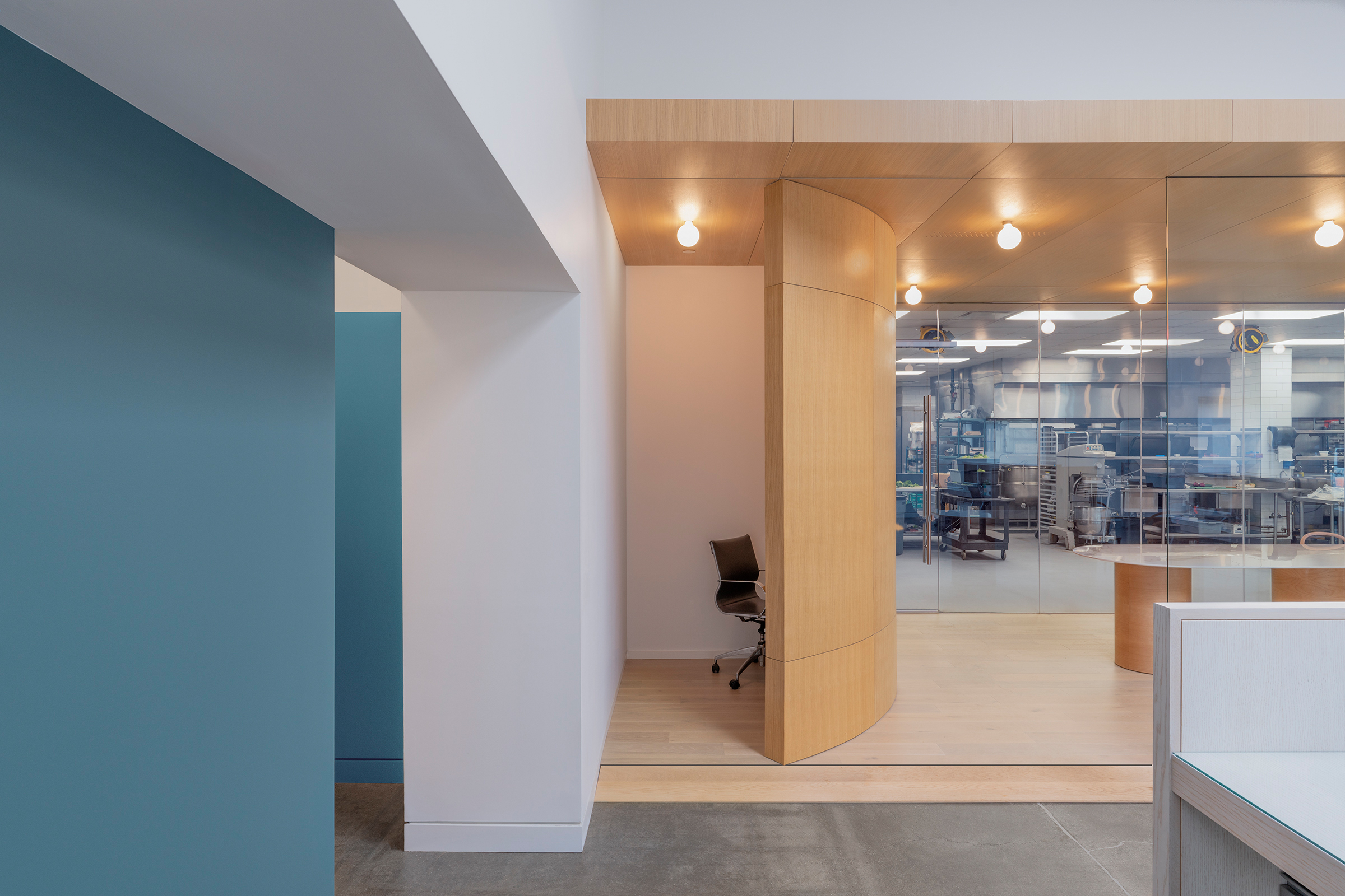
Both tasting rooms have light beech chairs by Ton and AKDO stone slab tables designed by ABA. The smaller tasting room has a black and gray cylinder table that can hold six people while the larger tasting room displays a grand 18-foot-long white stone slab table that can comfortably seat 20 guests. In the smaller room, ABA incorporated a curved wall, which forms a small hallway for easy access from the office to the kitchen. A similar wall is mirrored at the opposite end of the larger tasting room where a small, private workstation resides.
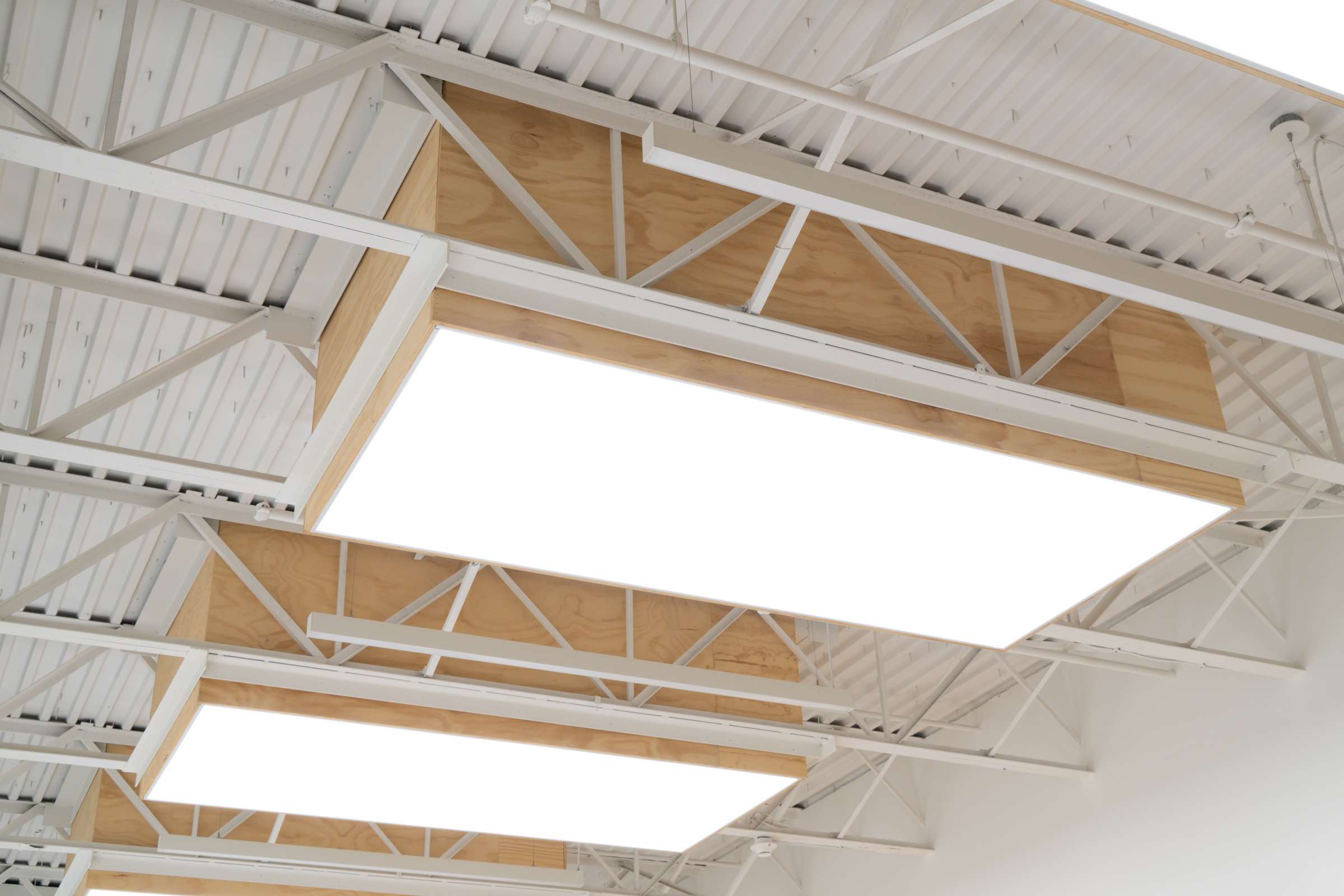
In the eventing office, a smooth concrete floor pairs with subdued cubicles located under industrial skylights from Wasco Commercial that are woven in between the original trussed ceiling coated with white paint.
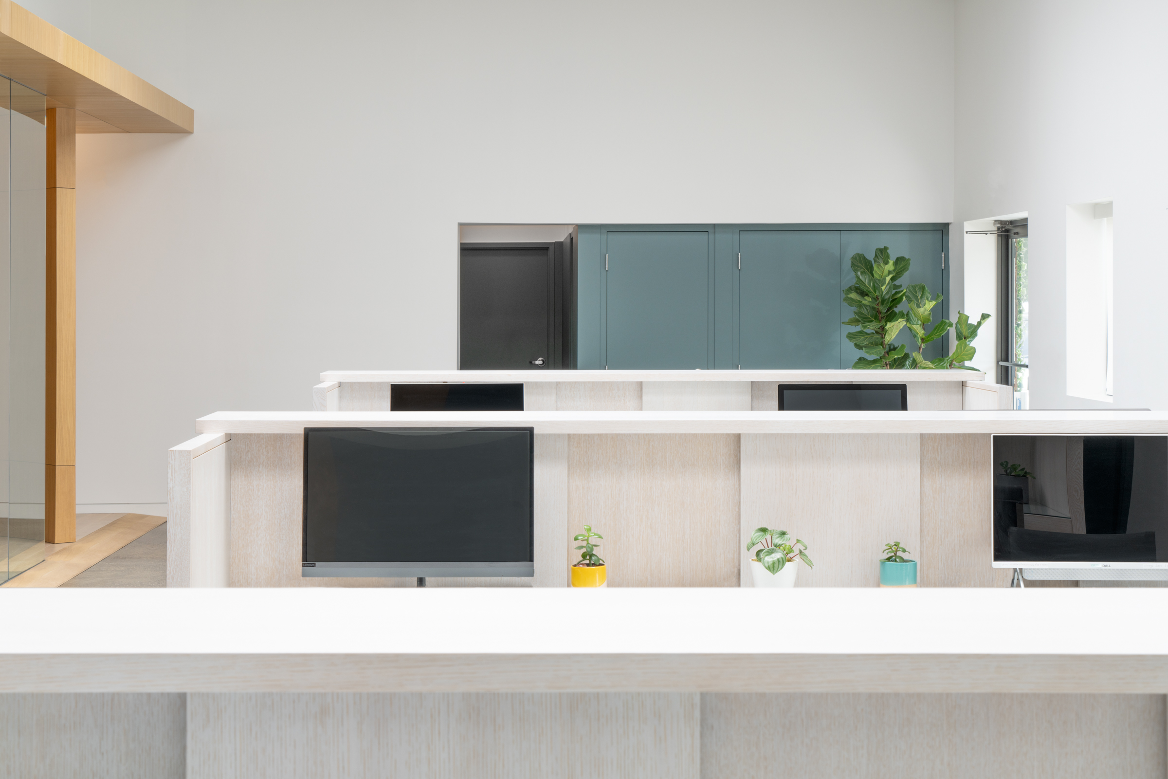
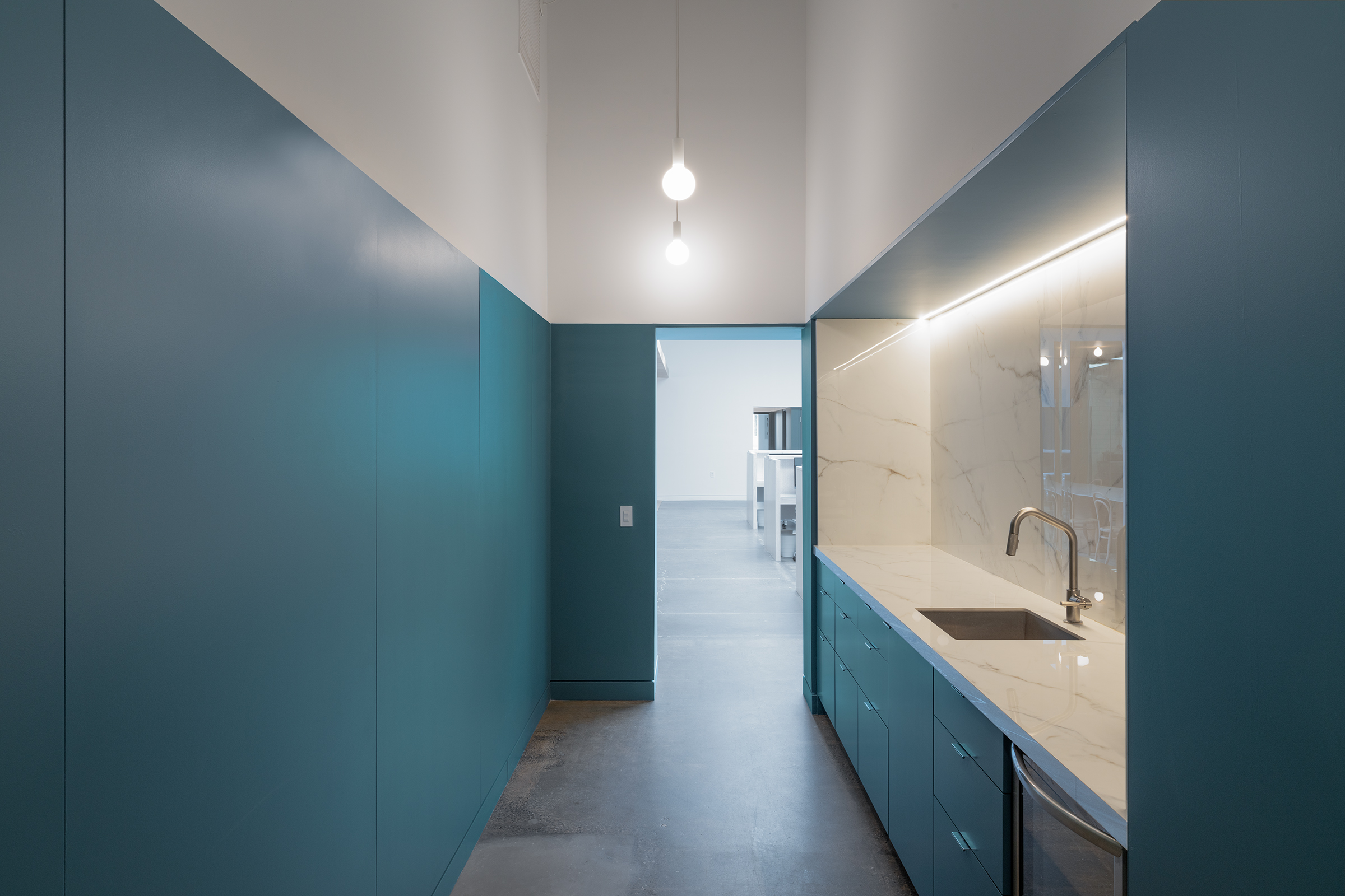
Within the private quarters for the workers, like the bathroom and kitchen, a continuous language of green-blue panels contrasts against the concrete floors. The color is a welcomed addition to the already neutral palette of the space and offers a distinction between private and public.
Abruzzo described the project as transformative: “In terms of how our clients use the space day-to-day and keep inventing new ways to invite in the public and frame gatherings there—as well as for the goals of the project in its recognition of kitchen work and being employee-first: this is what it looks like when you put those needs and goals forward.” Every layer of the eventing company can be seen in each section of the space. All elements come together at the end presenting the final recipe of the tasting rooms.