Laundry and lounge: two design typologies that never seem to go together, and yet fit perfectly so. In San Antonio, SOAP Laundry Lounge makes waiting for clothes to be washed comfortable with a coffee-shop-meets-laundromat concept. Conceived by Emily Strayer (yes, that Emily Strayer, the founding member of Chicks), SOAP innovates the humble typology with a new type of third space. She approached FÖDA to bring the full brand experience to life—from signage and interior design to the uniforms and “out of order” signs.

“Emily approached the project with enormous grace and humility,” Jett Butler, founder and chief creative officer of FÖDA told AN Interior. “We think that spaces grant people certain permissions. They tell you: Should I stay longer? Should I go quickly? […] The permissions here had to be: all are welcome, and everyone deserves to do laundry in a nicer way.” A sense of welcome and inclusivity drove the design, but not without a sense of play.

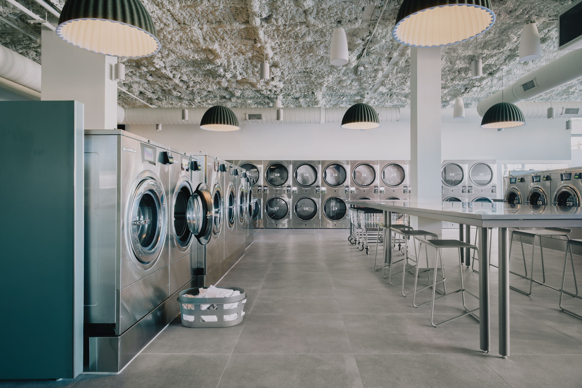
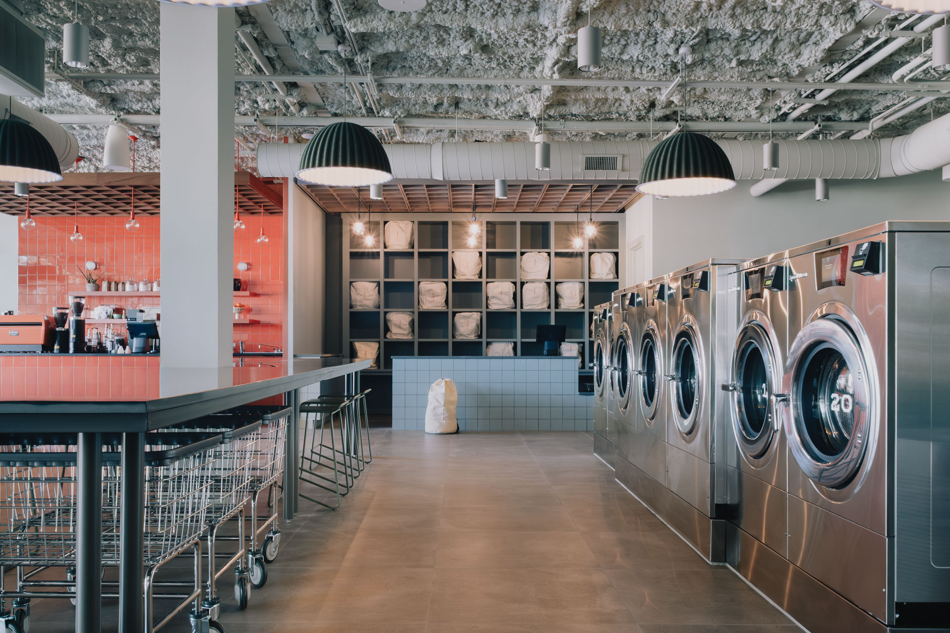
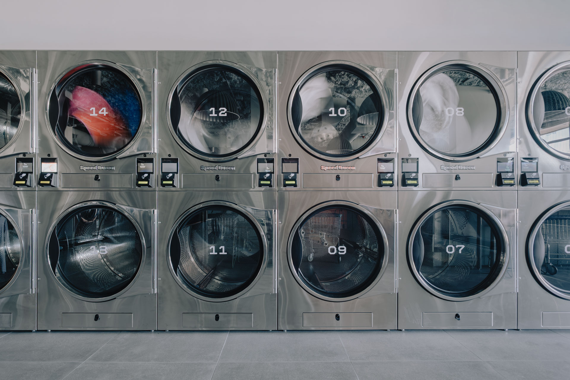
Occupying an old building of a former doctor’s office, SOAP uses its unique typology to its funky advantage. Laundry machines are points of reference everywhere. “We focused on the machines themselves and let that geometry and grid be the inspiration point for the brand identity,” said Stephanie Leung, the director of interiors at FÖDA. Sixty four state-of-the-art Speed Queen machines, 28 washers, and 36 dryers, and a hospital-grade sanitation system span the 5,500-square-foot space in a typical grid layout. The grid then informs the rest of the space, including the tiles that make up the coffee counter and flooring, and the organization of cubbies and storage.
The circular window, the signature geometry of the washing machine windows, offers the contrasting shape in the design. Circular pendants hang above the machines while the store’s logo borrows directly from this aperture. The storefront’s blocky and playful sign features a circular cutout. FÖDA designed the mark in conjunction with the interiors as part of its brand-first approach, delivering a fully realized identity.

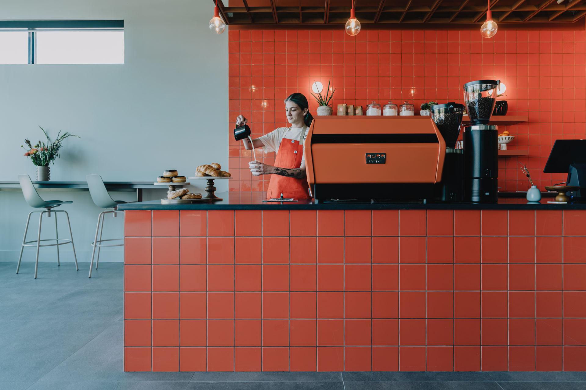
Color then identifies the dual typologies. While seafoam green and stainless steel make up the laundromat components, bold, bright orange takes up the front of the space, visually separating the coffee shop and seating area. “The color blocking in the space keeps the space light, fun, and approachable,” continued Leung. It immediately lets visitors identify and navigate the interior, while establishing a point of play. The design allows the two hues to joyously clash: The orange dividing wall in the coffee compartment comes up against the green dividing wall in the laundry section, forming two color contrasting stripes.
The effect is crucially fun but not overly fancy or lavish to keep the space’s inviting ethos. The ceiling unites both programs and exposes the industrial nature of the site. The lighting, which also doubles as acoustic absorbers, soften the rough and ready element.
“If you look at the body of work for the studio over the last 20 plus years, we’ve been willing to work at some pretty broad extremes: projects that are very small, that have shoestring budgets or no budget at all versus big budget projects for enormous entities and enterprises,” shared Butler. “If there is a common thread between these things, it’s a willingness to embrace or look at projects that contain a strange or wicked problem or a unique brief.” Funky yet functional, SOAP certainly rises to the atypical occasion.