
What with the founders of Malin + Goetz, Matthew Malin, and Andrew Goetz, having cut their teeth in the beauty and design industry respectively, it’s no wonder that their products, as well as their retail environments, are conceived with the purest aesthetic considerations in mind.
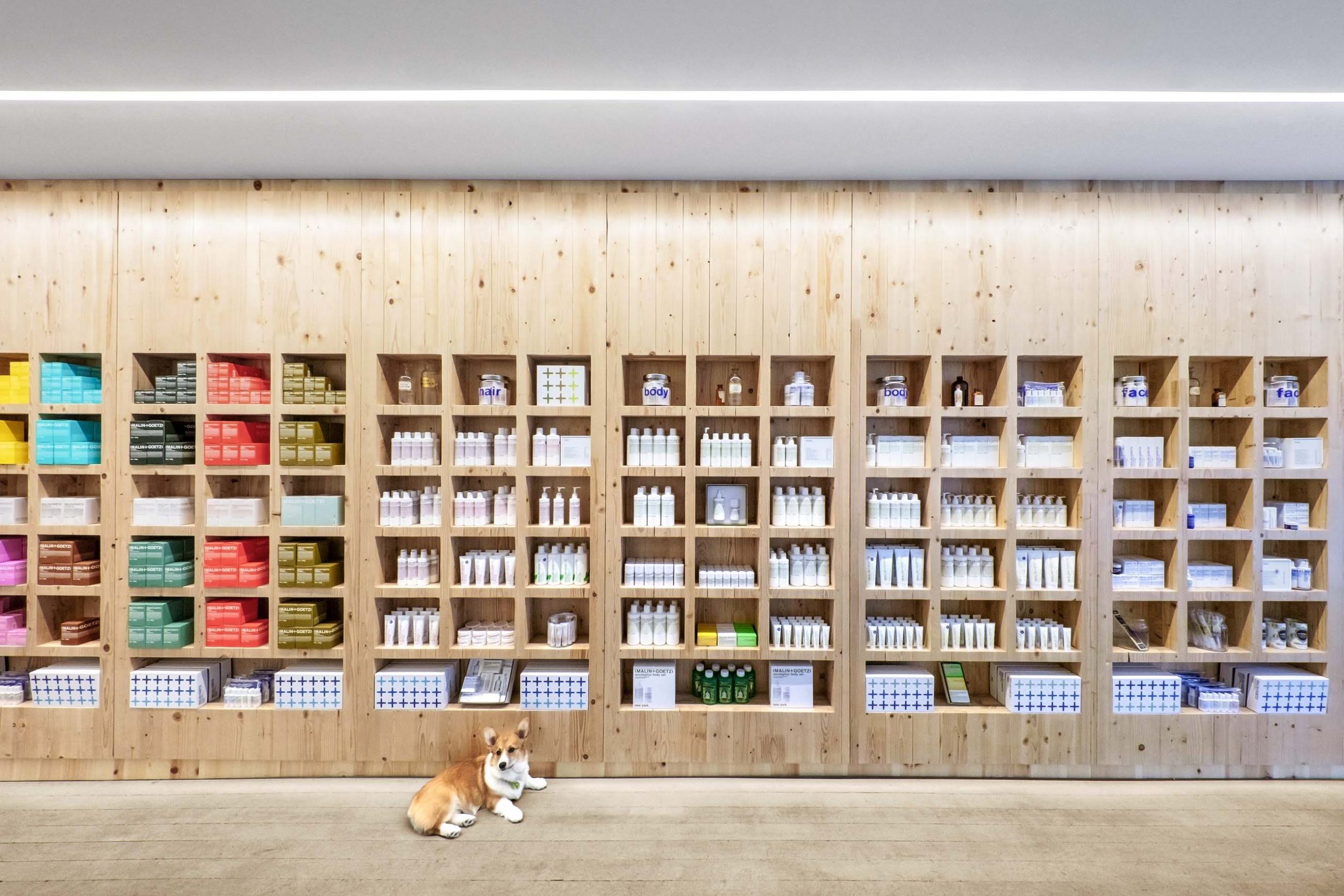
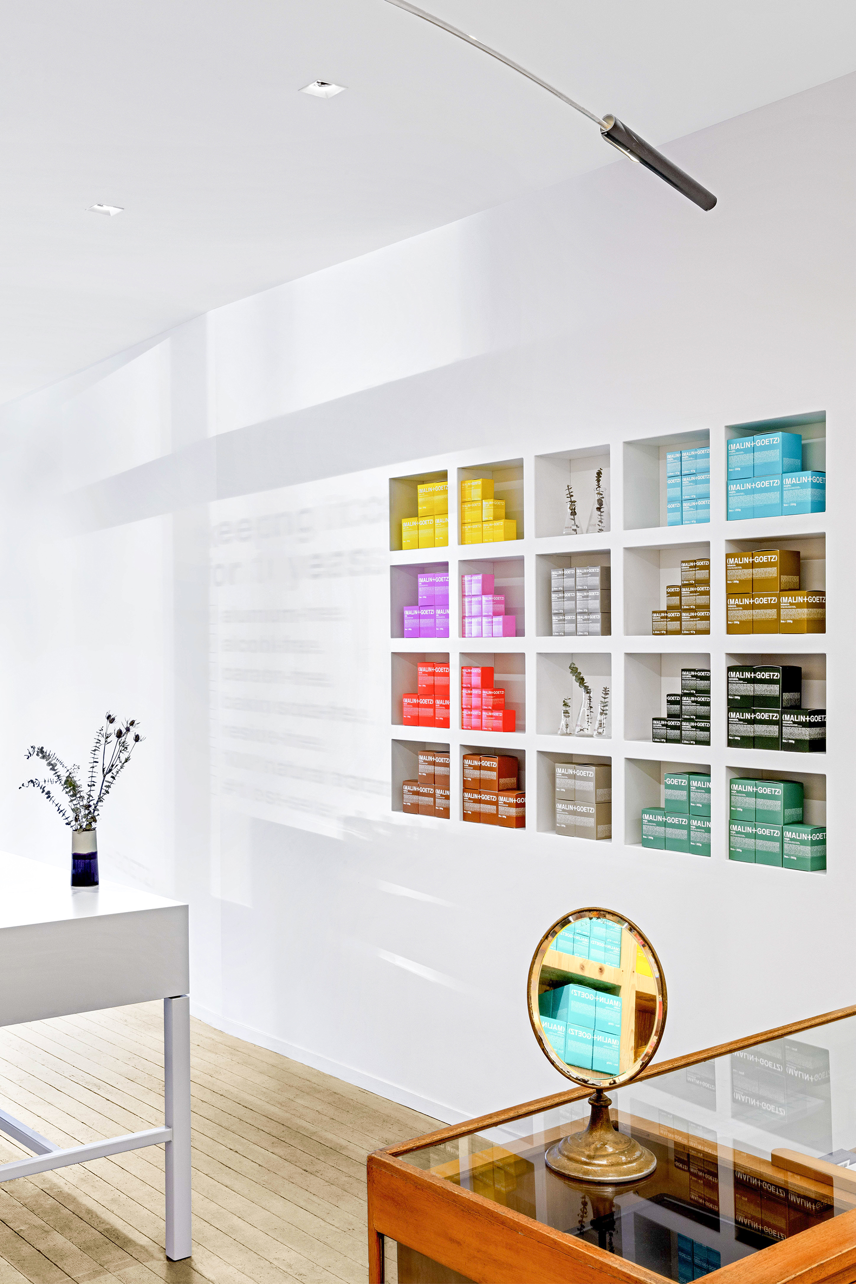
The New York-based skincare label’s minimalist packaging—bright colored lettering against a stark white background—is utilitarian with a modern flourish, a signature style they’ve extrapolated to the brand’s stores.
For their new San Francisco outpost, Malin + Goetz called upon Bernheimer Architecture, the Brooklyn firm the duo previously entrusted with the design of their home office in Manhattan and their first Los Angeles store.

“Malin +Goetz have always asked us for simple responses,” principal Andrew Bernheimer explained. “A modern and thoughtful approach that allows their products and the design of their products to remain legible.”
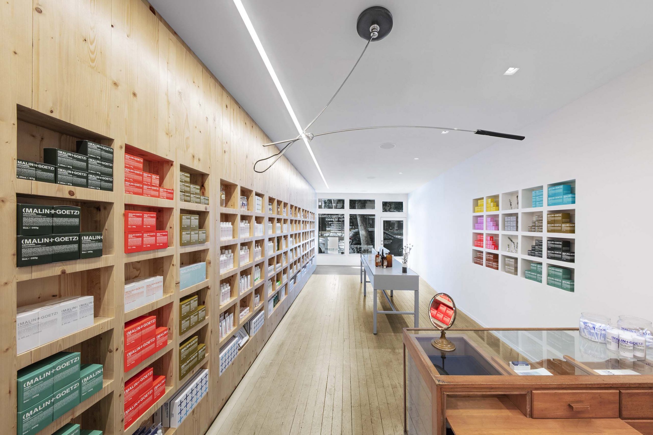
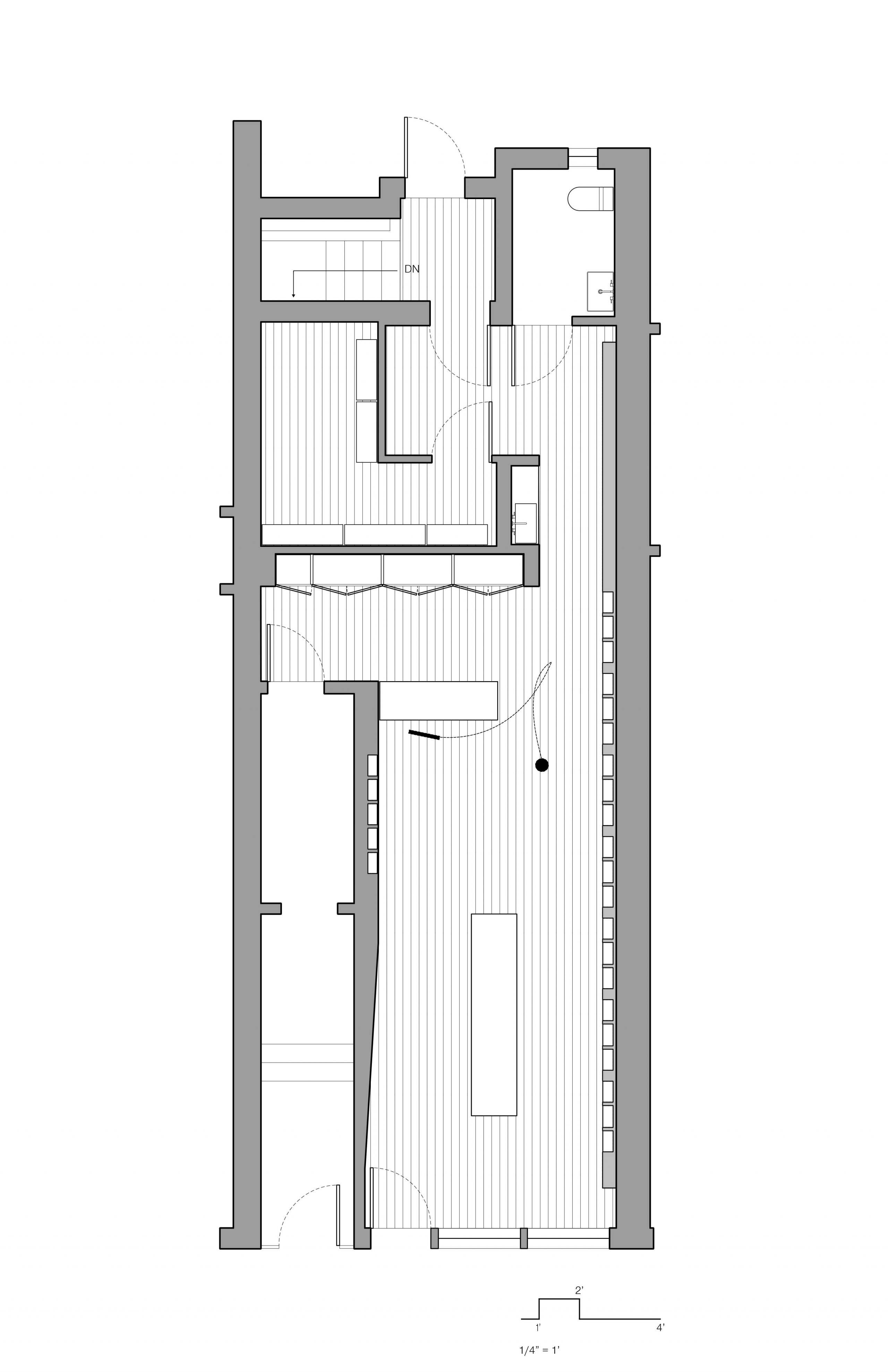
The straightforward rectangular shape of the floor plan meant that an uncomplicated scheme could be achieved with relatively few interventions: a necessity due to budget restraints and the age of the premises. For instance, some of the surfaces could not be removed. To maximize space, simple shelving with reduced depth resulted in an unencumbered shop floor concept.

To achieve this, Bernheimer turned to a sustainable solution: mass engineered timber, which is used all along the wall of display shelving. “We saw an opportunity to use this renewable resource and play with the manufacturing process of cross-laminated timber,” he added.

This solution, along with “a lovely and simple geometric scheme relying on single lines of light to draw one’s eye into the depth of the store,” by Flux Studio, creates an effective retail presence for Malin + Goetz—seamlessly suited to the brand’s design vocabulary.