
The sleepy Dutch city of ‘s-Hertogenbosch, colloquially known as Den Bosch, might not be on your radar. But during the early 15th-century, this former ducal capital played host to a fury of artistic activity. Inspired by the humanist ideals cropping-up in Italy and other parts of Southern Europe, the Northern Renaissance saw the emergence of many influential talents that help define the Low Countries’s prominence during the Early Modern era.
Among the long list of masters was Dutch/Netherlandish painter Hieronymus Bosch; posthumously named for his native town Den Bosch. Championing the fantastical illustration of religious concepts and narratives, Bosch is perhaps most recognized for his seminal The Garden of Earthly Delights triptych altarpiece (1490 and 1510). Much like the similar Last Judgment (1482) and The Haywain Triptych (1516) works, this iconic piece explores the duality of heaven and hell, with the depiction of perilous earthly-temptations in between.
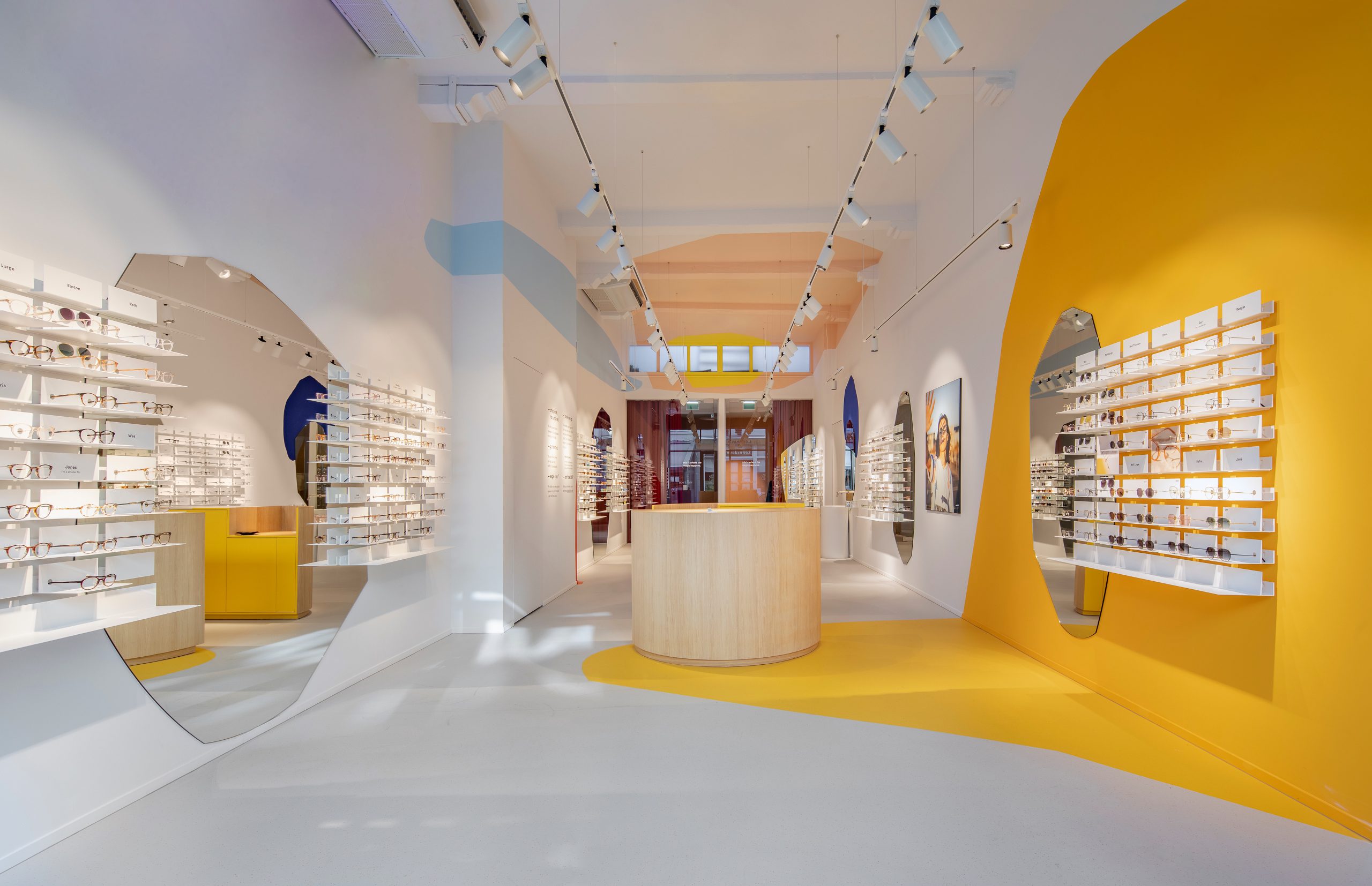
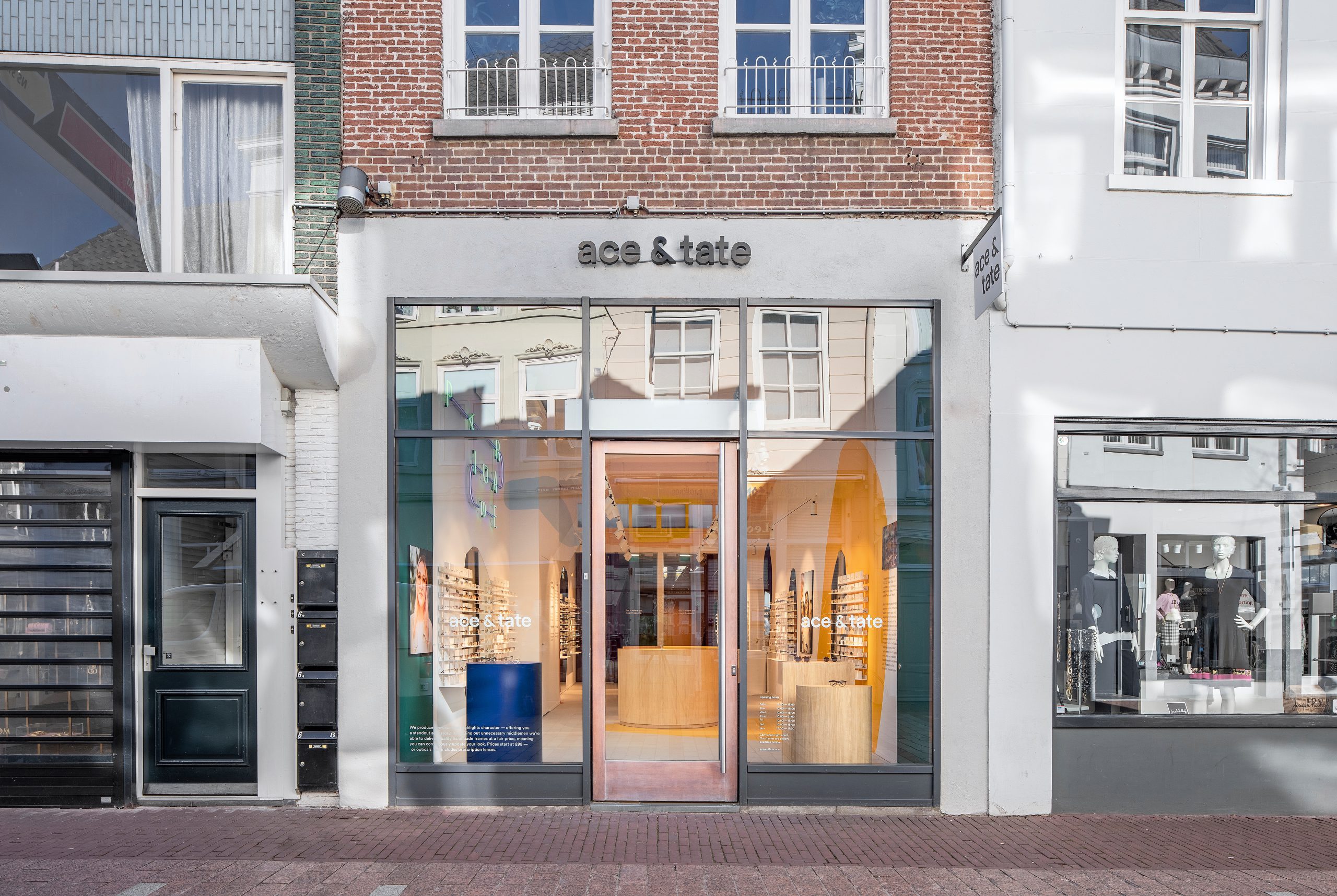
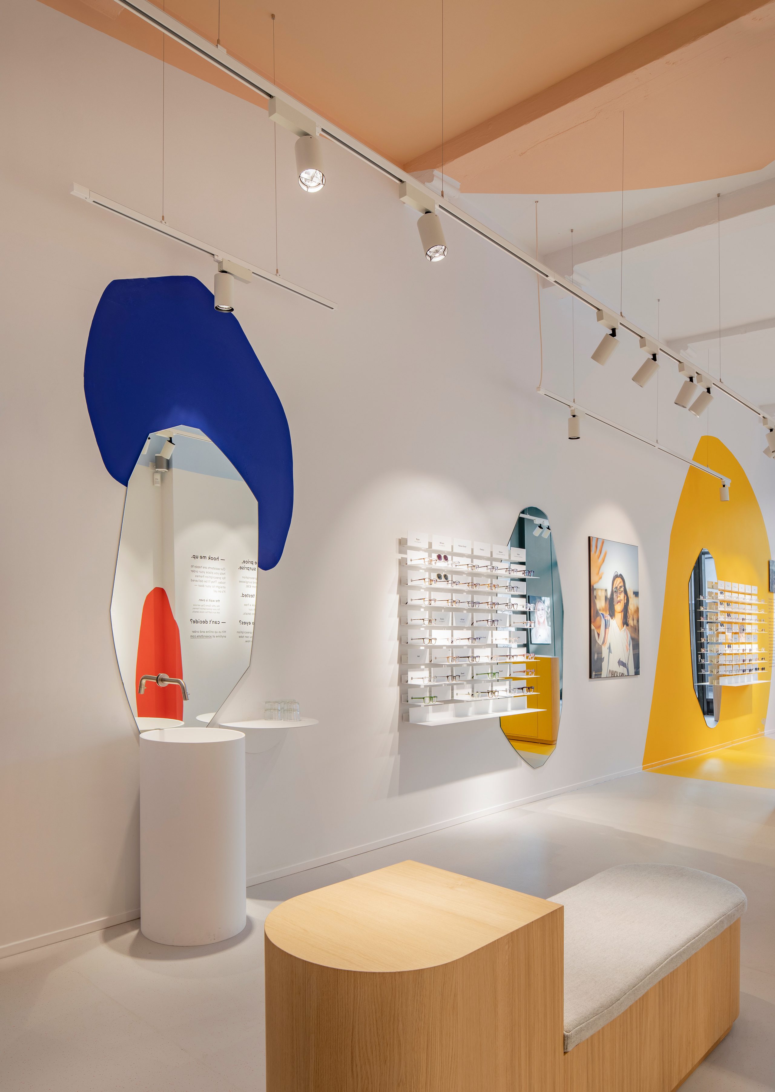
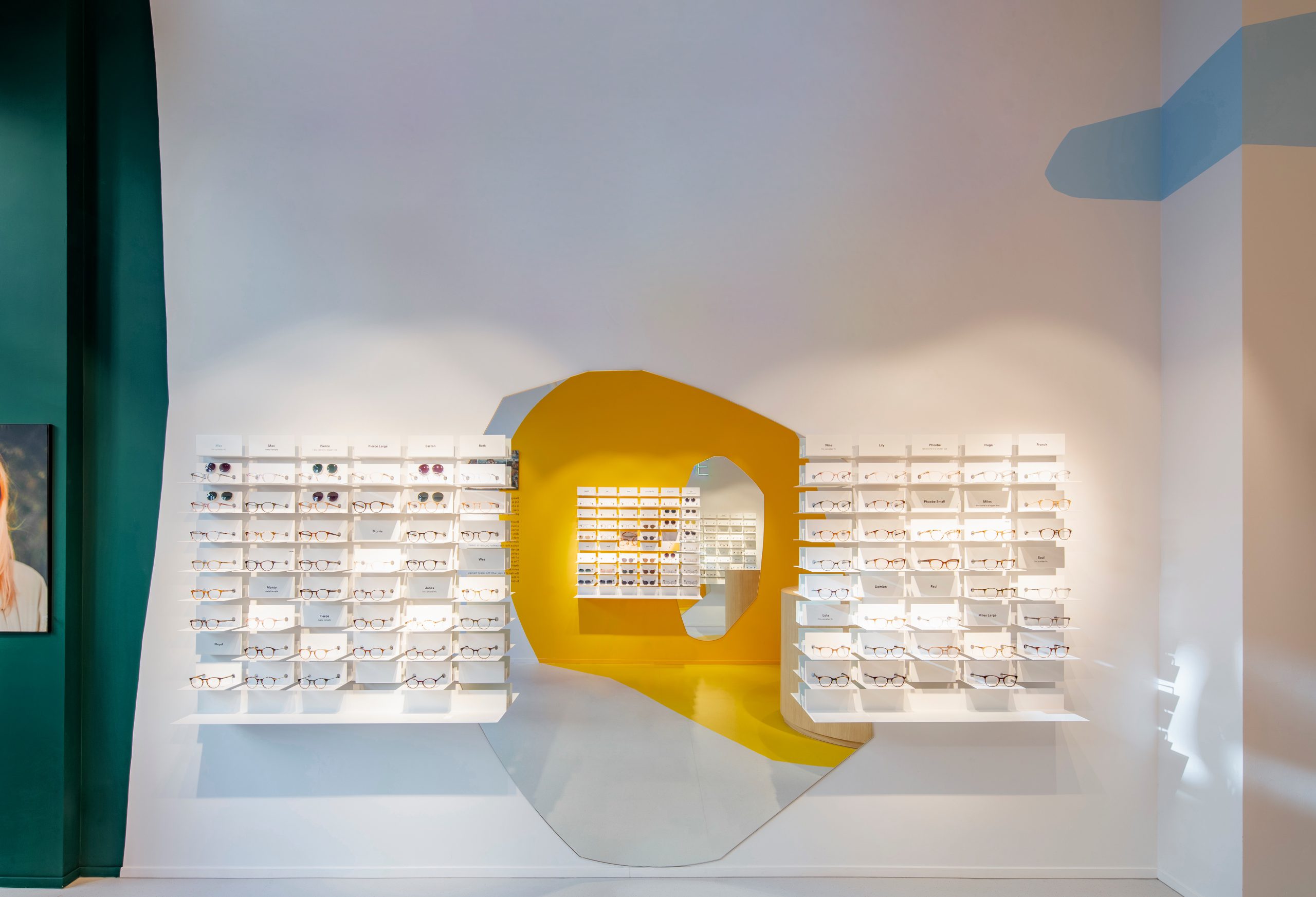
Drawing inspiration from this local artist legend, Dutch design studio OS ∆ OOS (Oskar Peet and Sophie Mensen) designed its third retail space for boutique eyewear brand Ace & Tate in Den Bosch with a color-coded schematic. No strangers to strong references or rigorous concepts, the duo sought to emulate, and to a certain degree, depict the full-image of Bosch’s Haywain Triptych as three worlds: heaven, hell, and earth. OS ∆ OOS evoked this age-old trope through the use of a particular wall mural pattern and bespoke furnishings.
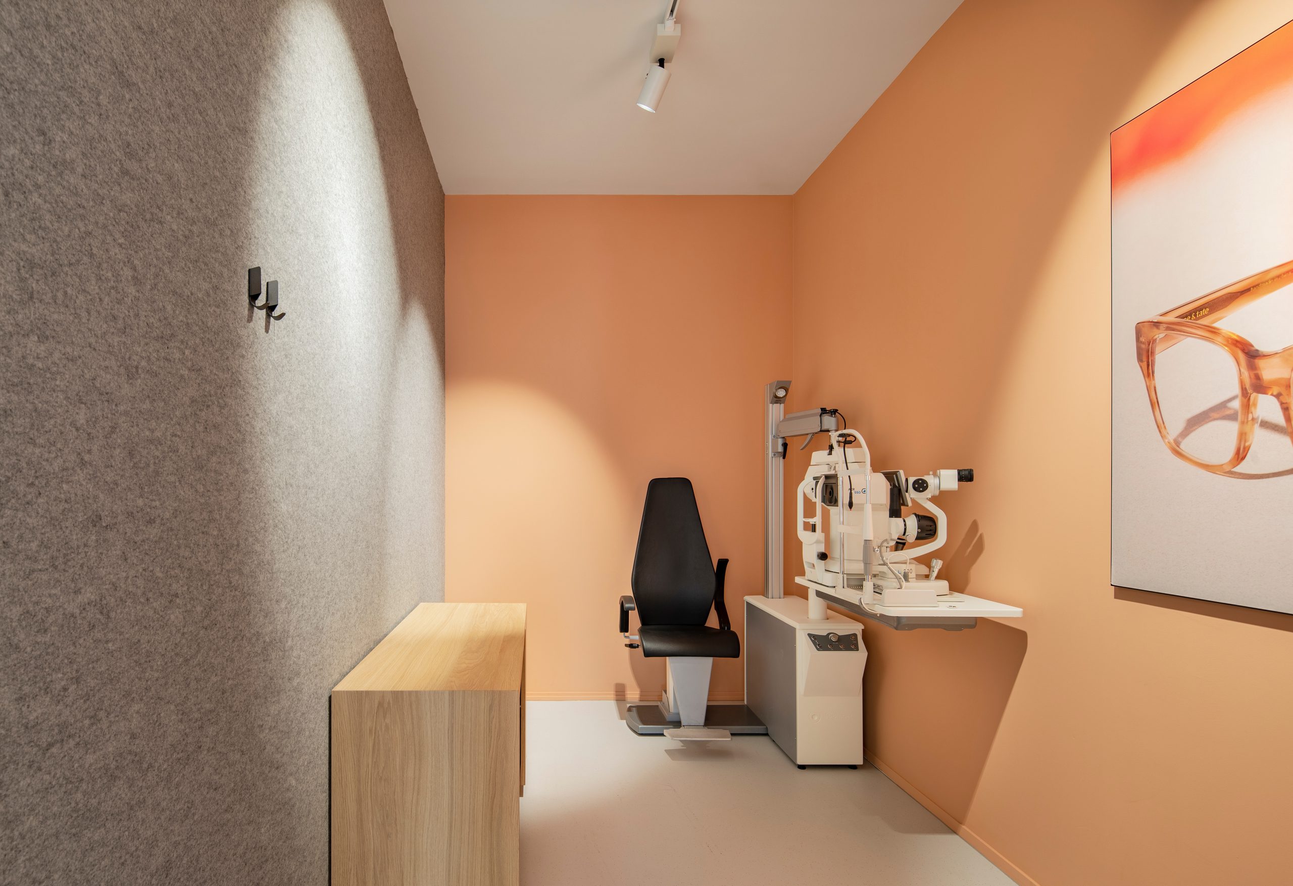
Cheekily reminding the store’s visitor to renounce earthly delights, low-lying display tables and benches evoke modest hay-bails. Above, back-facing windows suggest heaven. A fountain, a favorite element in Bosch’s work, sits just right off the store’s main counter and lets clients wash their hands as an almost religious ritual but essentially, as a sanitary option to take out their contact lenses. Primary colors, evident as large wall blotches, are used to denote but also challenge gender constructs—the eyewear brand’s male and female collections. Hell is suggested in a pink-clad, dark examination room, toward the back of the space.

Working from the nearby city of Eindhoven and as graduates of its prestigious Design Academy Eindhoven, Peet and Mensen approach various furniture, accessory, lighting, and interior projects by rectifying the tension between form, function, material, and concept. Not necessarily defined as minimalists, the pair explores the complexity of a design problem and seeks to address the essence of its solution. Whether its a lamp that evokes the movement and interaction of different celestial bodies in motion or a thematic interior, OS ∆ OOS’s designs only convey what they intend to. Often the form and function of their limited edition designs are grounded and justified in conceptual reference.
The duo’s work has been shown at major institutions like the Design Museum London, as part of collaborative projects like Domestic Monuments (featured earlier this year), and collective exhibitions like those mounted by Dutch Invertuals. The practice has also developed distinct schemes for Ace & Tate’s Dublin and Eindhoven locations and is currently working on the brand’s Groningen outpost.