Run-of-the-mill pharmacies tend to be sterile environments with white metal shelving and fluorescent lighting. Large chain and independent operators alike emphasize efficiency, safety—and hopefully, hygiene—rather than decor. For healthcare entrepreneur Olivia Tchanque, spurning decor is a missed opportunity. Opening new-concept pharmacy Angel Care in the northeastern Philadelphia suburb of Cheltenham offered her a chance to shake things up a bit and implement design as an equally vital—even healing—component. Her community has been particularly affected by the opioid crisis and Tchanque sought to create an exuberant space that could serve as a mollifying force destigmatizing and elevating recovery.
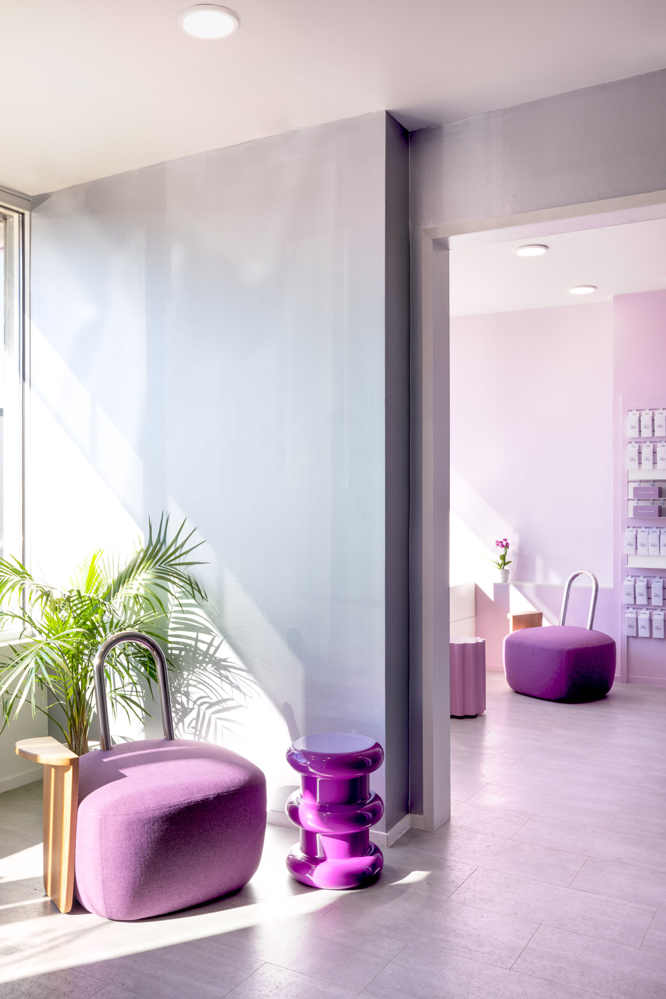
She called on Italy-born, Brooklyn-based talent Sergio Mannino, one of famed designer Ettore Sotsass’s last assistants, to outfit the space with a sophisticated yet playful aesthetic. He implemented a scheme that incorporates clean geometries, nuanced textures, and simplicity. His all-encompassing intervention carried over from the interior design to the independent pharmacy’s branding. Straightforward shapes were carefully layered to help establish a sense of calmness, inclusion, and positivity.
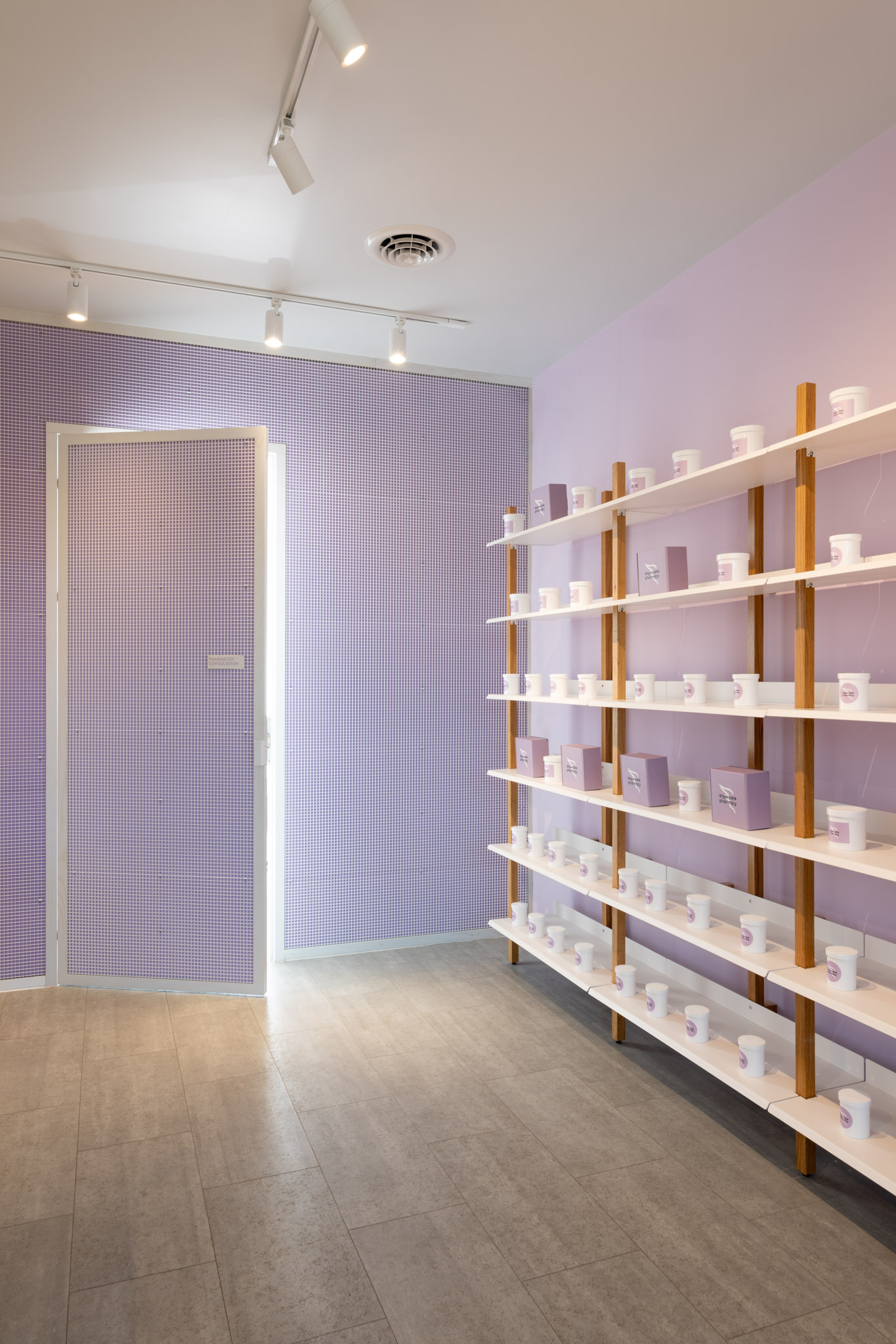
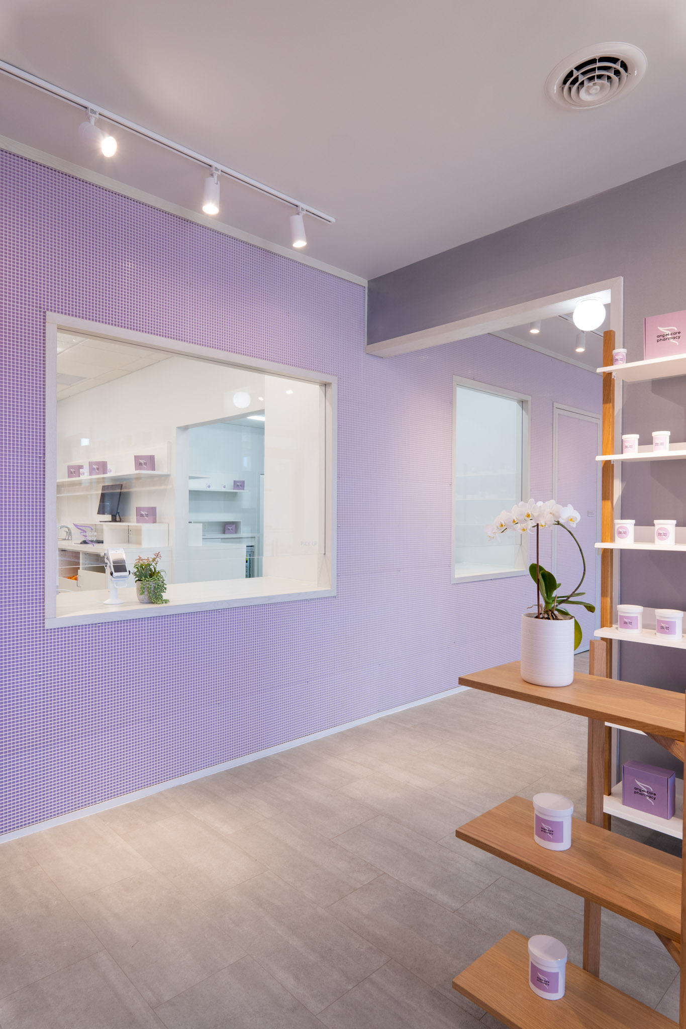
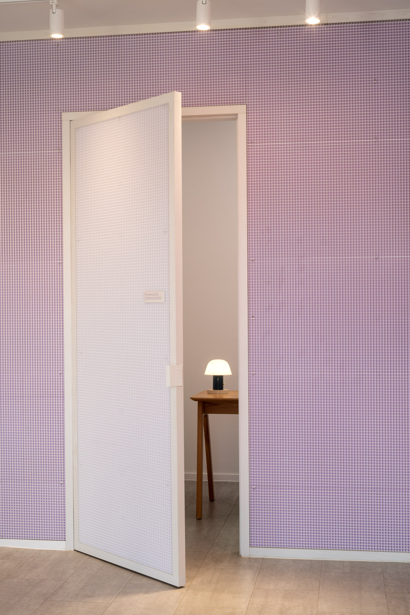
Mannino’s most important tool, however, was the bold but not overpowering use of three tones. In the designer’s words, “Mauve is the color of balance, representing tenderness, and it’s frequently associated with femininity and motherhood. White brings a feeling of safety and purity. It represents the absence of things and a sense of relaxation and clarity. And silver has always been associated with the moon, inspiring a feeling of joy and peace.”
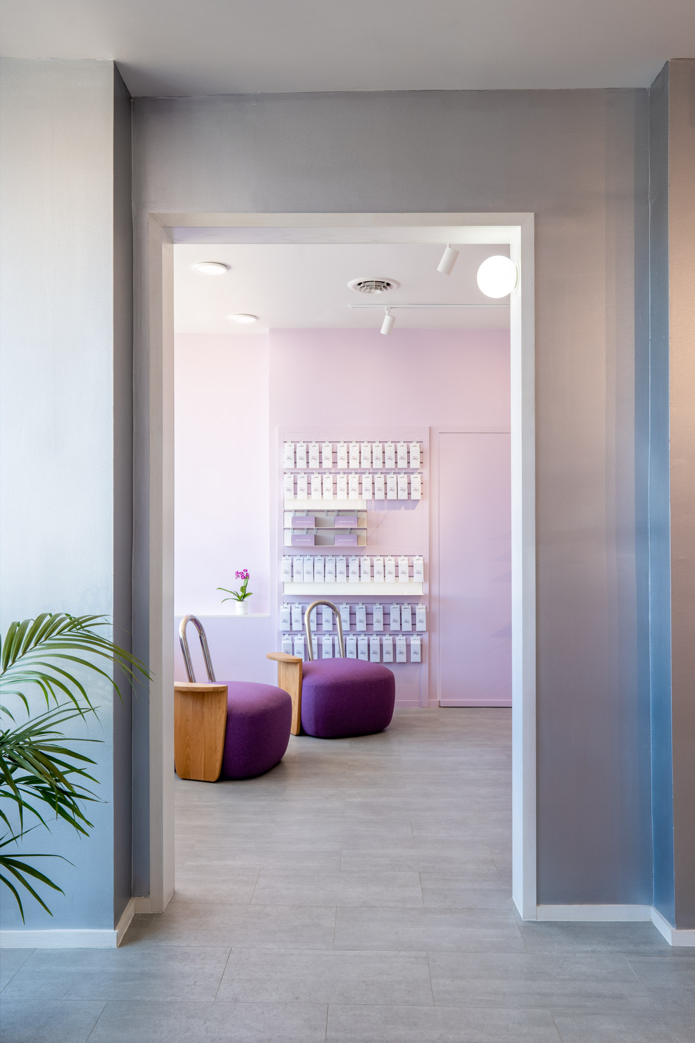
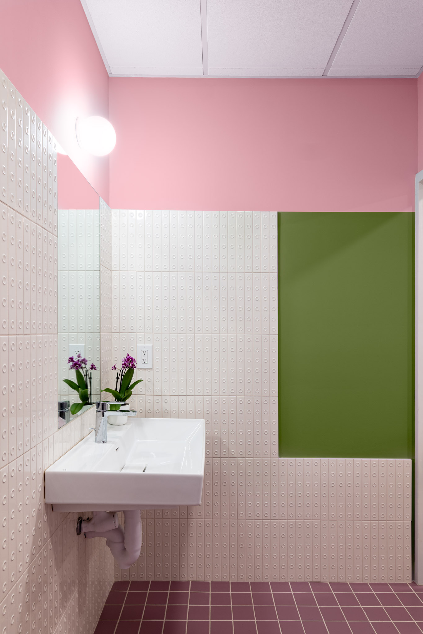
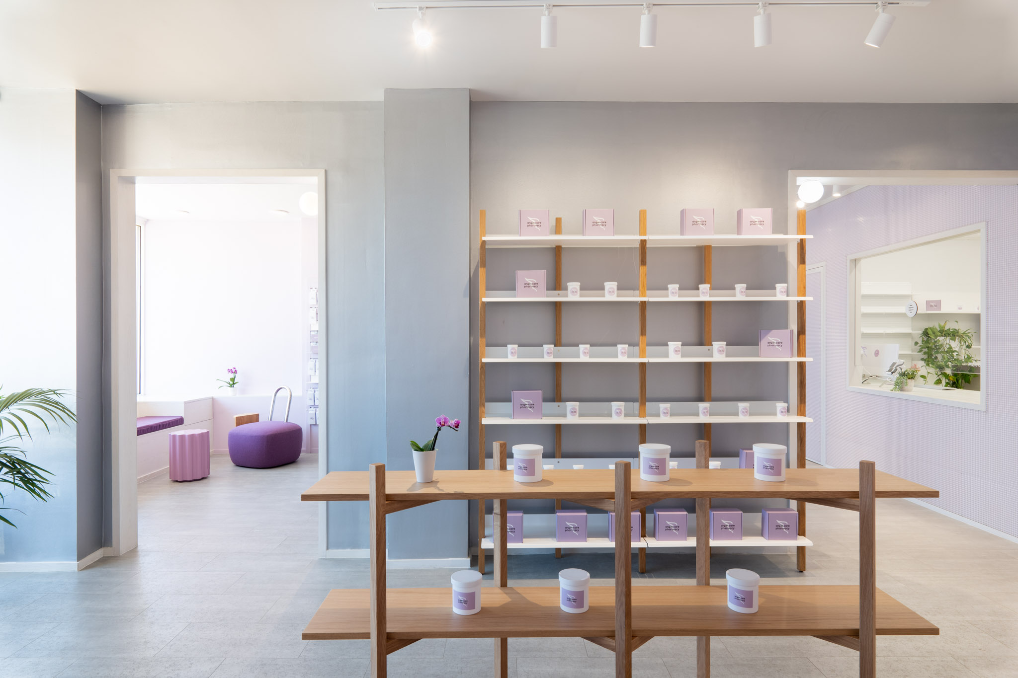
The 1,800-square-foot storefront, situated along main commercial thoroughfare Rising Sun Avenue, was transformed with luminosity in mind. Natural light floods in from large street-facing windows. The open-plan volume is divided into two rooms: one for retail operations and another for picking up prescriptions. A wall that once delimited two separate stores was punctured in two places, allowing for a more even flow. Other surfaces are covered in spectrum hues and grid-pattern wallpaper.
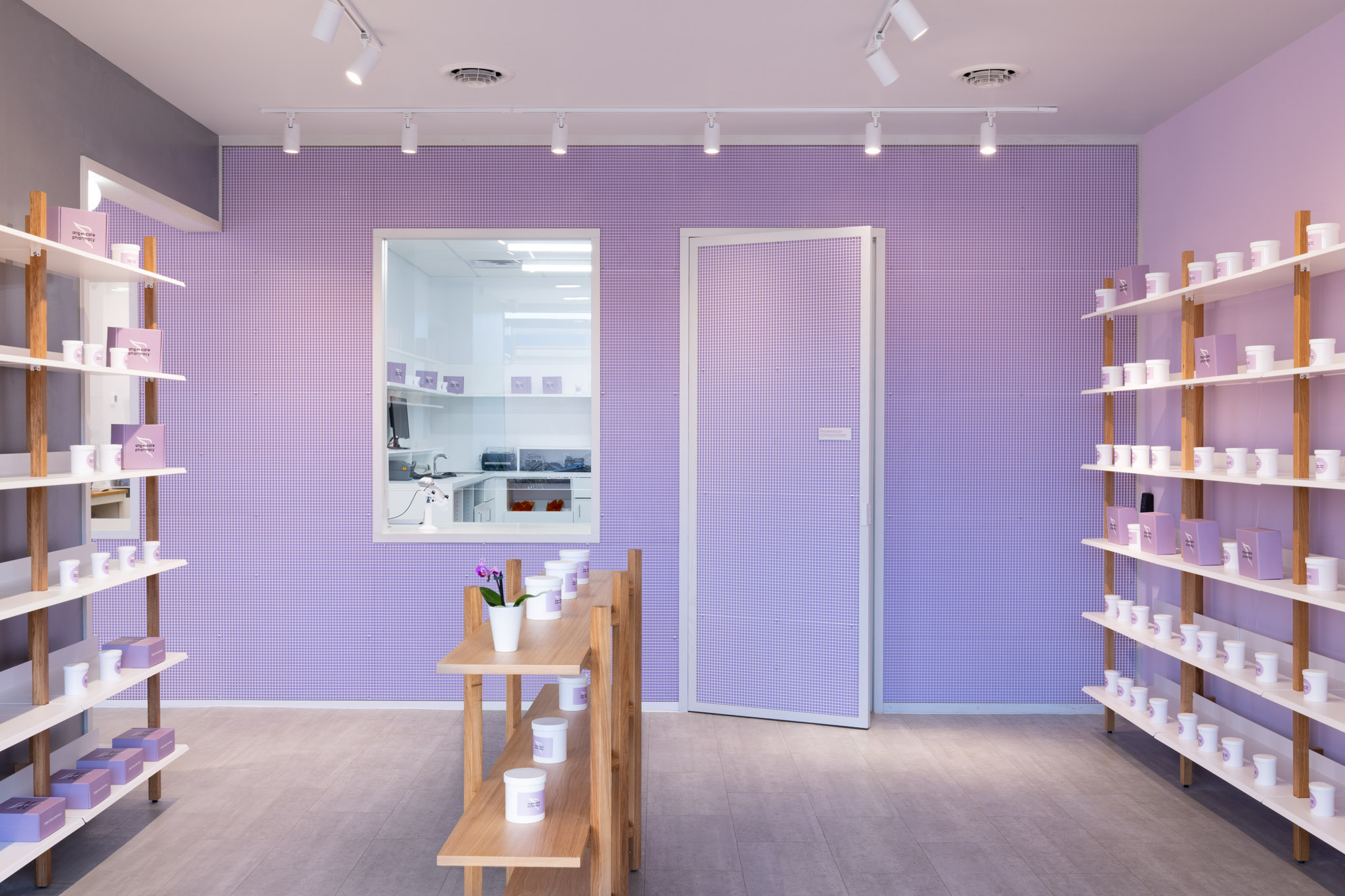
Custom settees take on an organic, almost neotenic quality and play off of more rectilinear shelving systems sourced from Blu Dot and Hem. Chrome and oak-wood finishes extend the overall color palette. Standalone Artemide luminaires join Lumenture track lights. As a finishing touch, Mannino also introduced Sotsass’s Memphis movement Colonna and Pilastro side tables.
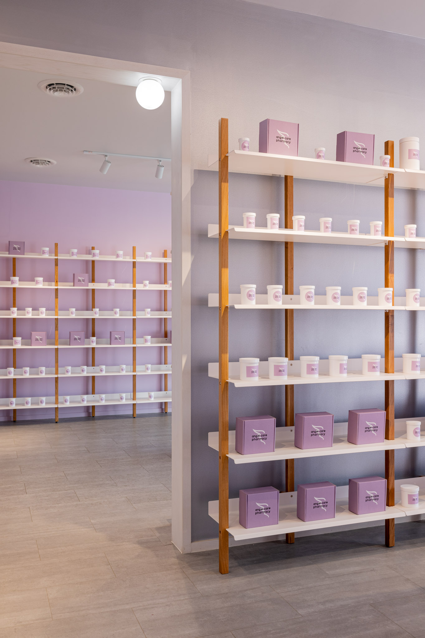
Along with Angel Care’s logo and overall graphic identity, Mannino also designed compostable vials and bags as an alternative to plastic packaging. “On average, U.S. pharmacies fill 60,000 prescriptions per year,” Tchanque said. “We hope to ignite changes in the sustainability of pharmacies’ operations by starting with small actions.”