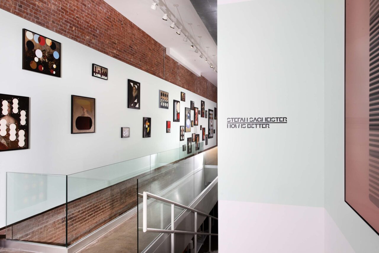
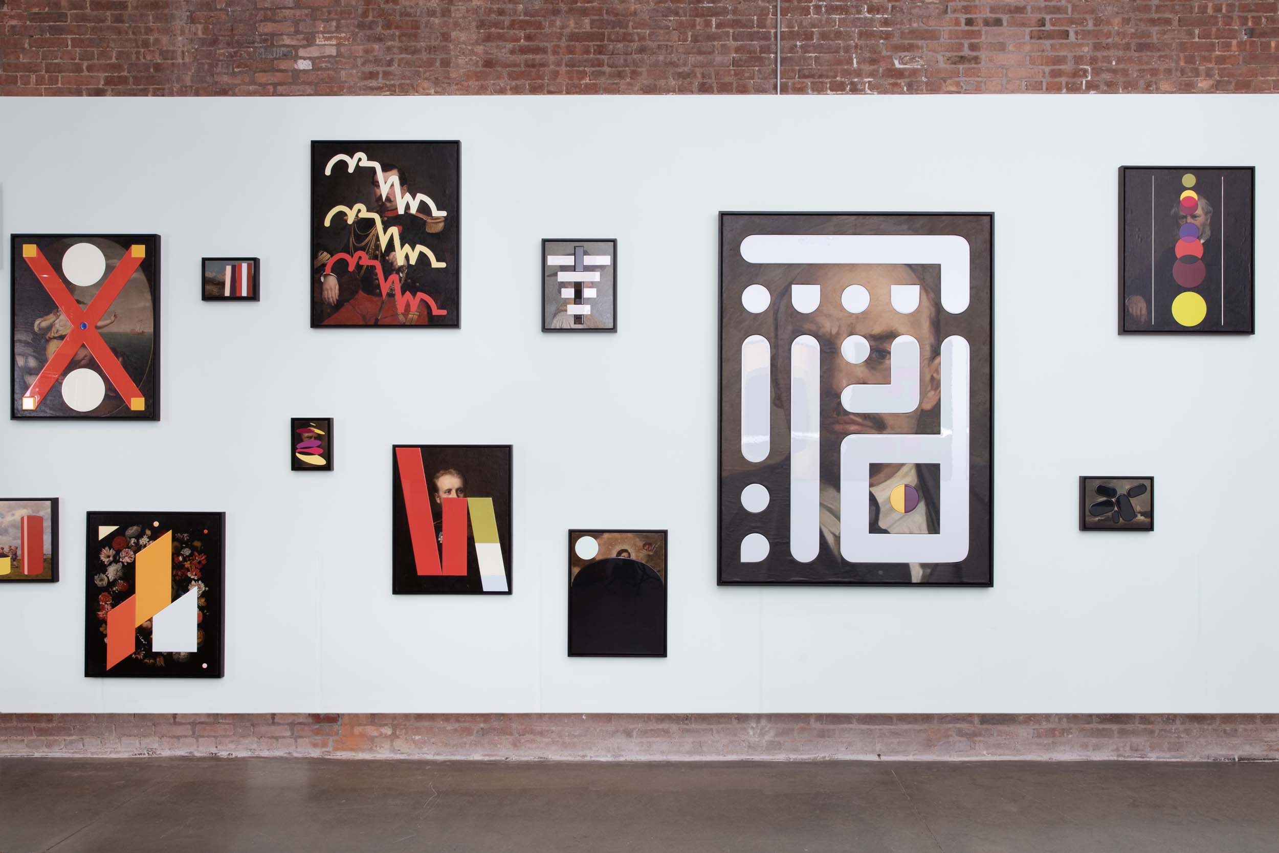
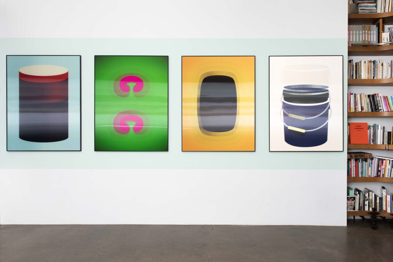
With today’s headlines, it is easy to assume that the world is headed downhill fast. But with a longer view of humanity’s course, things look brighter. This is the cheery premise of Austrian designer Stefan Sagmeister’s Now Is Better project, currently on view at Patrick Parrish in New York. In addition to lenticular pieces that morph as one orbits them, Sagmeister has made a set of works that translate data trends (life expectancy, homeownership rates, etc.) into visualizations. The colorful shapes are incised into old canvases and feel like thickened versions of John Baldessari’s dot-obsessed productions. In person, the inserts glimmer like shiny pills. The layouts and hues are expertly composed, though one should expect nothing less from such a renowned designer. Sagmeister began the project during the pandemic in 2020; today, its hopefulness matches the sense of relief that arrived to many as typical civic life resumed. The exhibition runs through June 16, but don’t fear if you miss it: Phaidon will publish a book about the project in October.


