An apartment in Nagatacho, Tokyo, has gotten a hypersaturated candy-colored makeover courtesy of English designer Adam Nathaniel Furman.

The 1,700-square-foot, three bed, two bath unit is a sumptuous study in material contrasts that aims to ameliorate some of the mundanity of everyday home life.
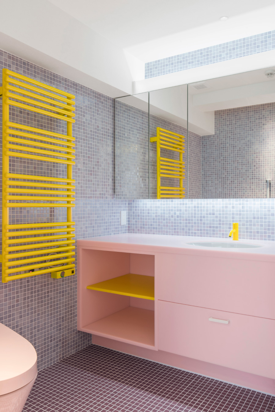
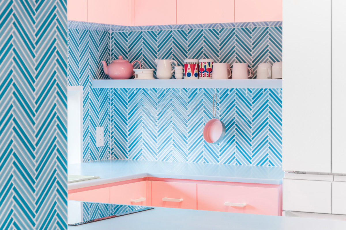
The unit’s programming is organized around its central spaces, the living room and kitchen, and color is used to delineate each element. Pastel pink cabinets in the kitchen sit alongside a hand-finished spruce wall divider, as baby-blue countertops meet a herringbone backsplash rendered in iridescent turquoise tiles. Ceramics that mimic the colors found throughout the space line the living room’s white shelves, providing pops of vibrancy and complexity even in the more “restrained” spaces.
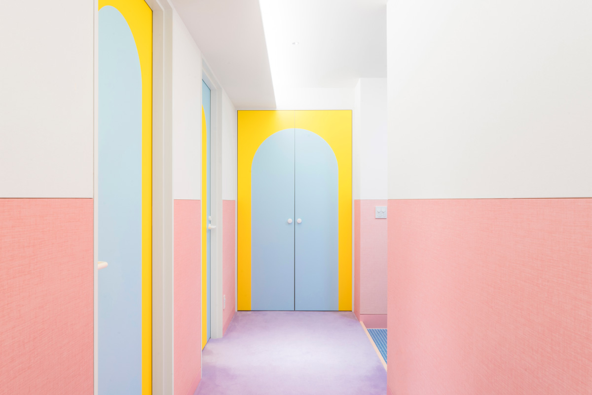
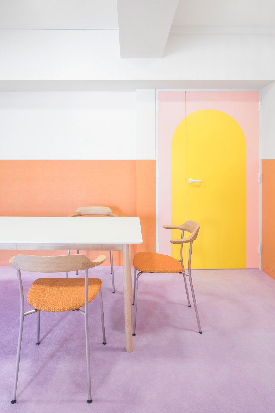
That interplay between opposing colors and materials was intended to maximize the difference between each. The hand-worked wooden details and furniture are in intentional contrast to the laser-cut inlaid doors and plastic marble. Carpet beside vinyl, and colored, textured wallpaper that abuts white, matte plastic walls.
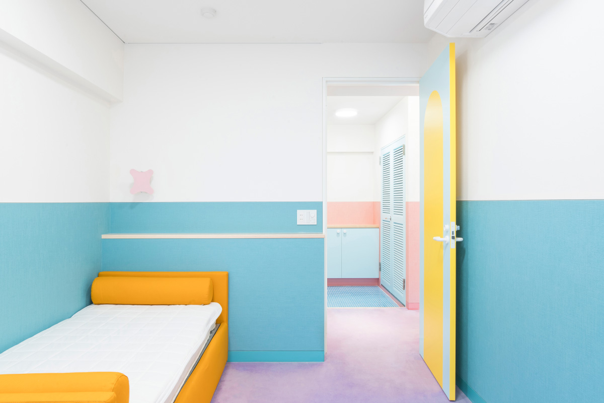
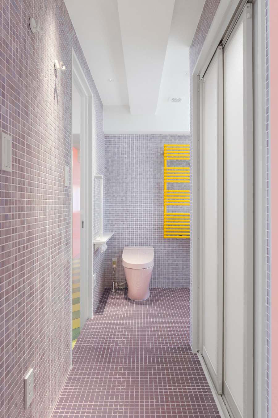
Although color is plentiful, plenty of consideration went into making sure the home was livable and not a total sensory overload. The colored portion of each wall ends abruptly at a standard height of four feet up, where it meets a more standard white wall. And, although different hues are easily found throughout, they’re kept mostly muted apart from a vibrant yellow splashed on a few doorways, and the Vitra faucets and accompanying towel racks.