VDK is a company based in Stuttgart, Germany that builds and manages affordable housing. Its office is located on the ground floor of a residential building from 1954, later converted to an office building in the 90s. The space worked, but it was small and inefficient. Local architecture practice Studio Alexander Fehre came onto the project to improve flow and functionality, while elevating the space with a more modern style. The architects did so with a measured approach to surprise and juxtaposition.

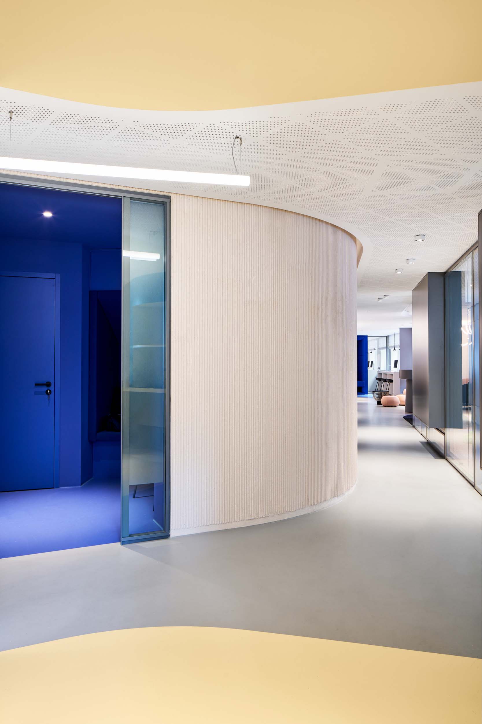
But first: layout. The architects resolved the tight, static floorplan by doing away with it completely. The studio gutted the two former ground floor apartments, revealing an almost 3,000-square-foot space. Then, they re-introduced organization, beginning with a sweeping corridor that cuts through the interior. Breakout rooms and workstations live around this passageway. The hallway organizes the different zones while helping make the space feel expansive.


Most of the space is dominated by neutral colors typically found in a commercial office—but surprising hues await around the corner. Color-blocking is used in different areas to further organize the layout and make the corporate space a little more exciting. The reception area, for instance, is clad in a light peach tone with matching-hued furnishings. Off to the side, however, a small seating niche is covered in a bright blue textile, signifying a separate, solitary zone.


That same shade appears again in the focus room, similarly covered in azure, from table to seating to flooring. The bold color acts as an explicit shift in environment to help employees find respite from the laptop—or bring it with them to really lock in. Mellower tones also make an appearance like the pastel blue mailing room that lies just outside or the butter yellow restrooms, apricot-colored meeting booths, and pink kitchen and conference room beyond.

Material unifies these various colors and rooms, including stained, ridge plastered walls that run throughout the hallway and inside offices. The material’s raw construction material is contrastingly paired with an intricately perforated acoustic ceiling. The effect adds a warm, welcoming texture to the office space. It aptly continues the design’s motif of contrasting elements. Even the new facade of the office combines old and new: pigmented precast concrete, preserved elements of the original building, is now placed at a 90 degree angle to the indoor corridor.


The theme continues through the office’s furniture and lighting. Sleek, black pendant lights dangles between Artemide’s curving white tubes. While the former feels common to corporate spaces, the latter is a less predictable inclusion, yet, they hang together over a pink, custom-made conference and lunch table as if in a futuristic headquarters.


Edgy lighting choices appear again in a conference room, where Castor’s industrial recycled tube light modernizes more standard gray office chairs and table. It’s affixed to another unexpected design choice: a boldly painted elliptical on the ceiling that helps integrate the ceiling fan.

Studio Alexander Fehre’s restrained approach to clashing characteristics amounts to an office space that still resembles a corporate, work environment—unlike many of the home- and hospitality- inflected workspaces today—yet, it crucially also feels fresh and elevated. This is the design’s final juxtaposition and success: It’s both corporate and chic.