
“My house is me and I am it,” this stately quote from Daniel Manus Pinkwater’s 1977 children’s book, The Big Orange Splot, refers to the main character’s home that, with its bold shapes and fun colors, is reflective of his persona. For a project in Toronto’s Little Portugal, aptly titled Pink House, SHEEEP Studio’s founding director Reza Nik, interdisciplinary designer Connor Stevens, and the homeowners were given the book by the contractor, Renovations Ruth, who felt the project embodied The Big Orange Splot. The Pink House stands out in the crowd of row houses to complement those who occupy the space while offering inspiration to those who encounter it.


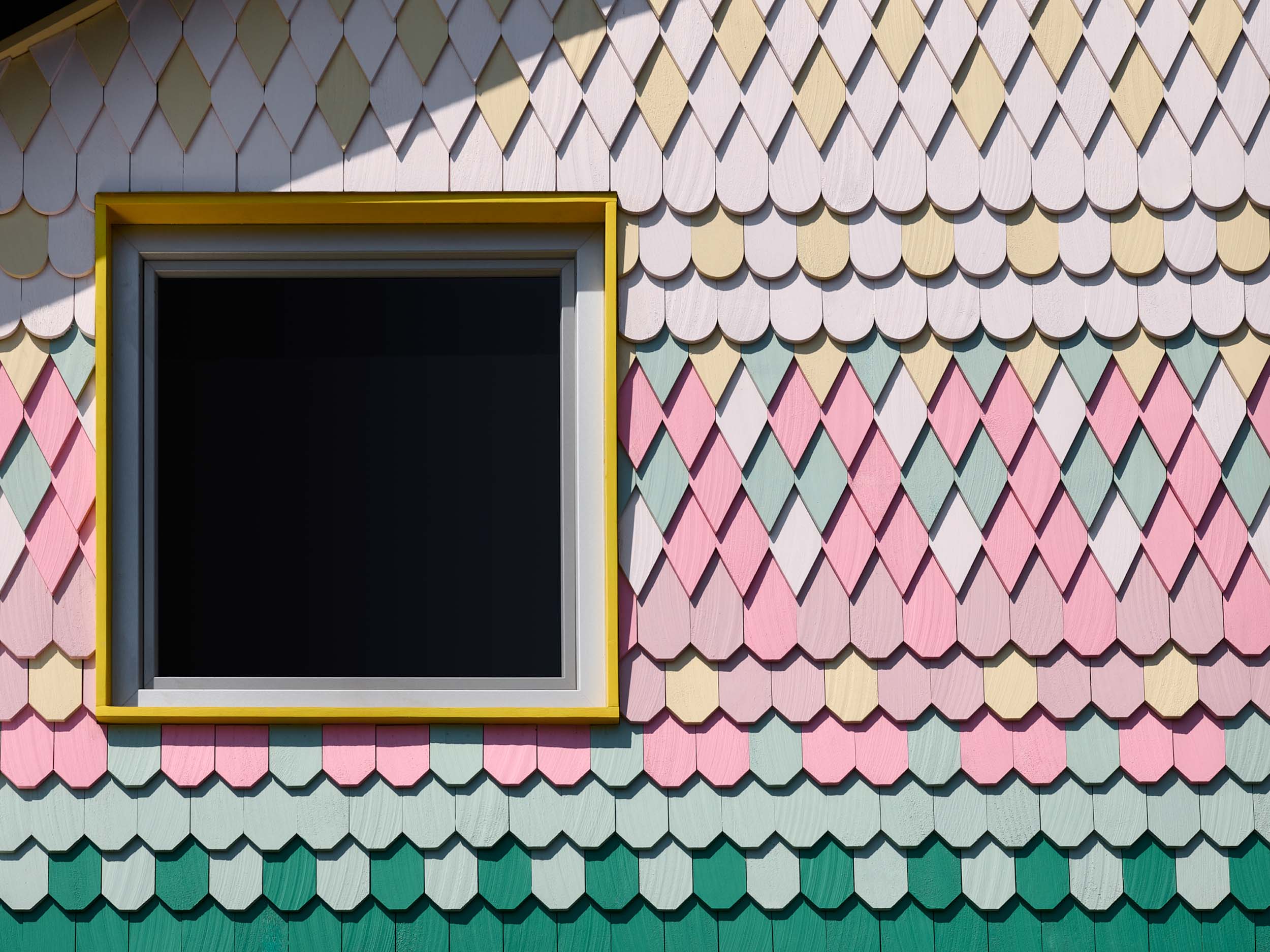
Originally built in the late 1800s, the 2,000-square-foot townhouse screams with individuality through its grand transformation. Zoe Hanneman assisted with the alteration as structural engineer. The back of the house is covered in a playful assortment of triangular and scallop-shaped shingles, cascading colors of pink, green, teal, and soft ochre. The front facade is equally bold as it is brick doused in light pink with dark green and red framing on the windows and door. The front exterior’s color scheme was inspired by a poster from 1950s Bonjour Tristesse which features pink and dark green. The homeowners Nick Shaw and Chris Sanchez provided it to the architects. “One of the things I do for every project is to ask clients to share things they’re into (music, films, art, food etc.)… to get a sense of the feelings and vibes,” explained Nik.
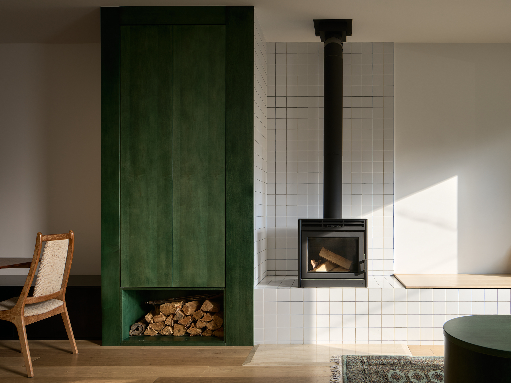
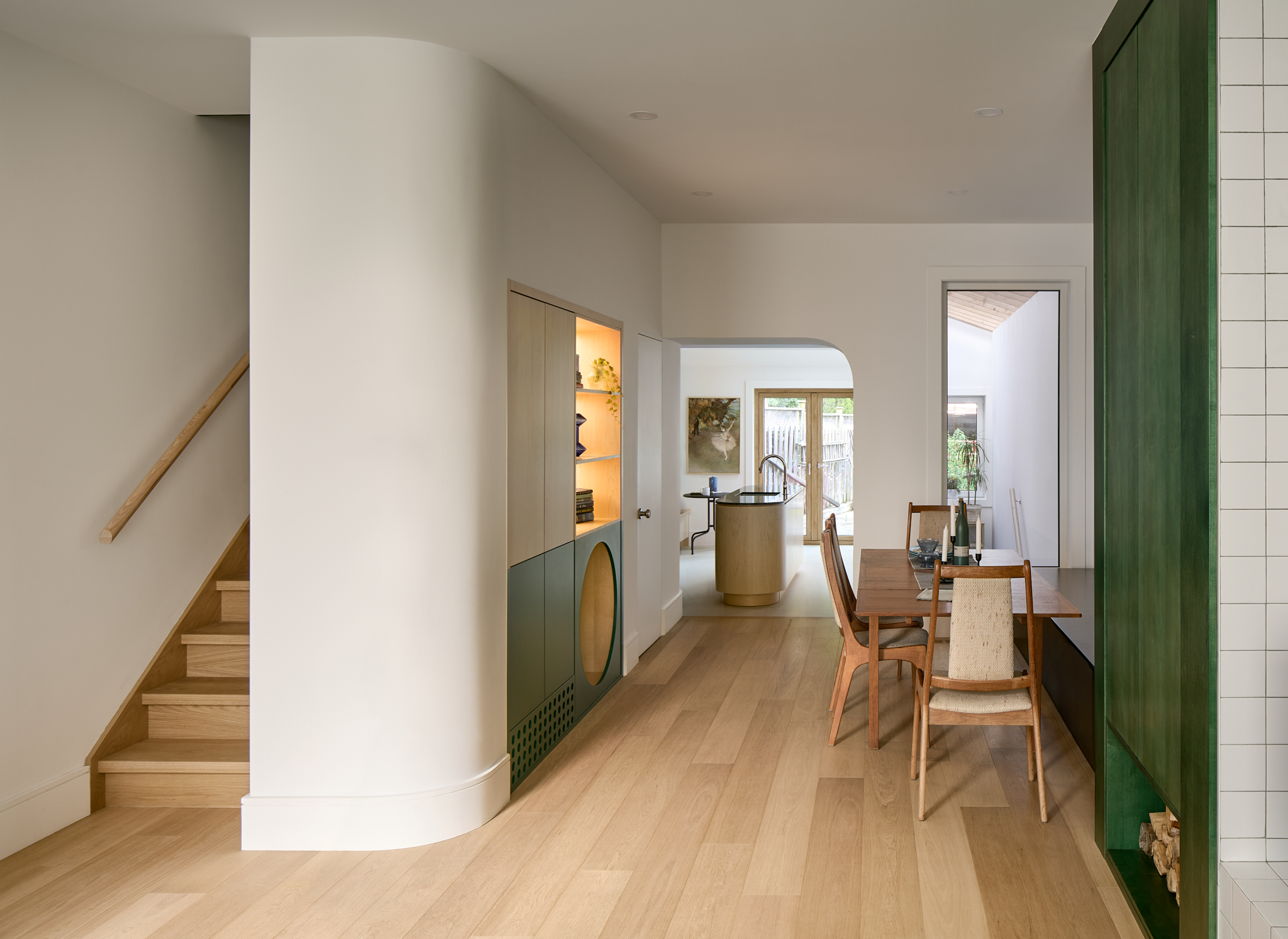
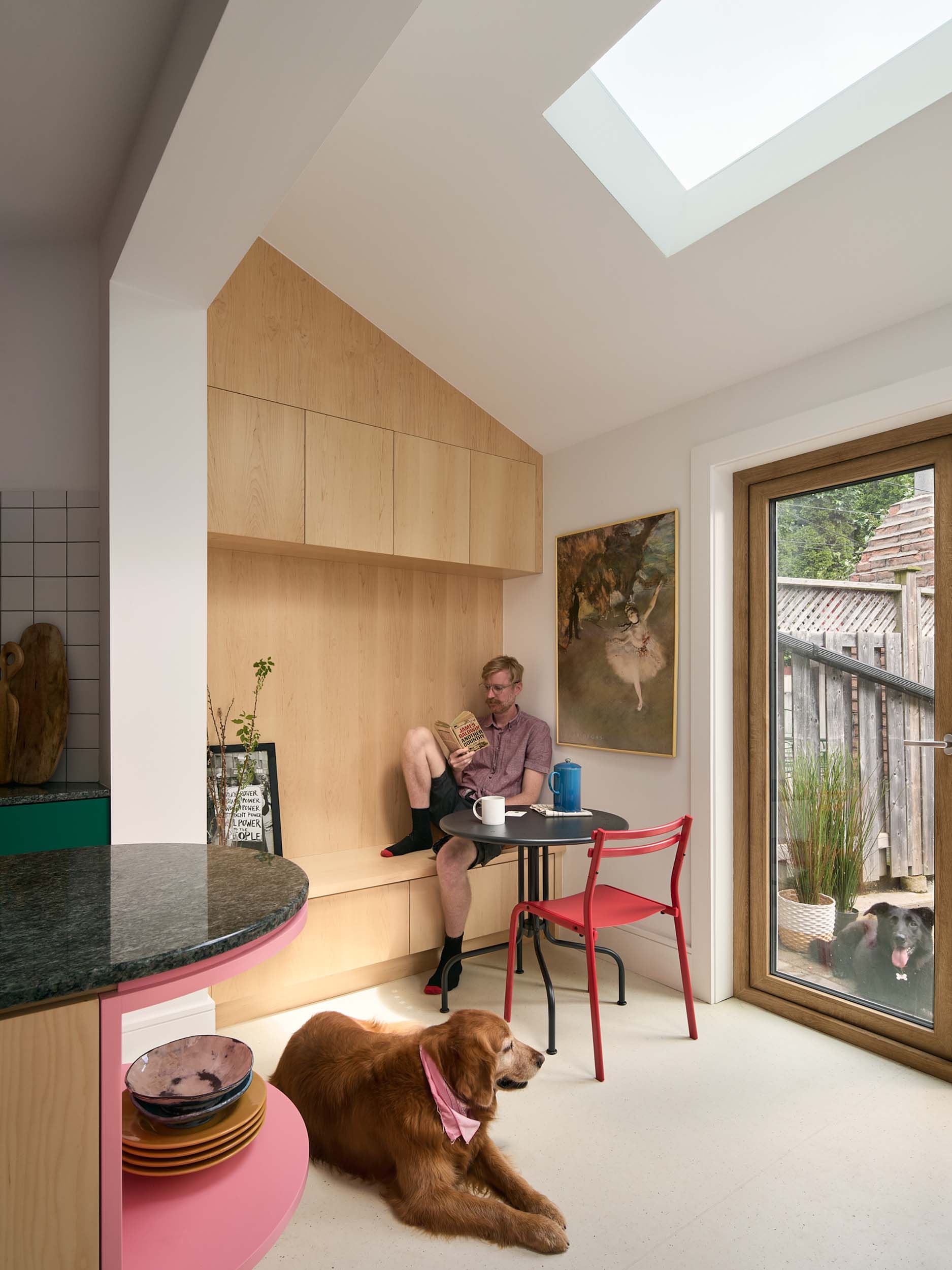
The exterior’s vivid color scheme seeps into the interiors through accented elements. When entering the home, the hues stand out against light wooden floors and cool white walls. Within the front sitting area, for instance, there’s a dark green millwork for storing logs of wood, another piece of green millwork that separates the entry, and then a built-in circular green cubby that acts as a dog bed. These are located near the wall composed of clean, white subway tiles.
Subtle curves also appear on the rounded shelves of the kitchen island, the curving wall before the stairs, and in the soft corner of a doorway.
To the opposite end of the first floor is the kitchen and breakfast nook, where the white grid of tiles continues to form a backsplash that contrasts with cabinets painted a shade of dark green. Pink filters into the space time coating the oven hood and the shelving found in the oval free standing island. The curves and stringent lines found within the home are quiet and purposeful—tag-teaming with the exterior shingles located on the back of the home.
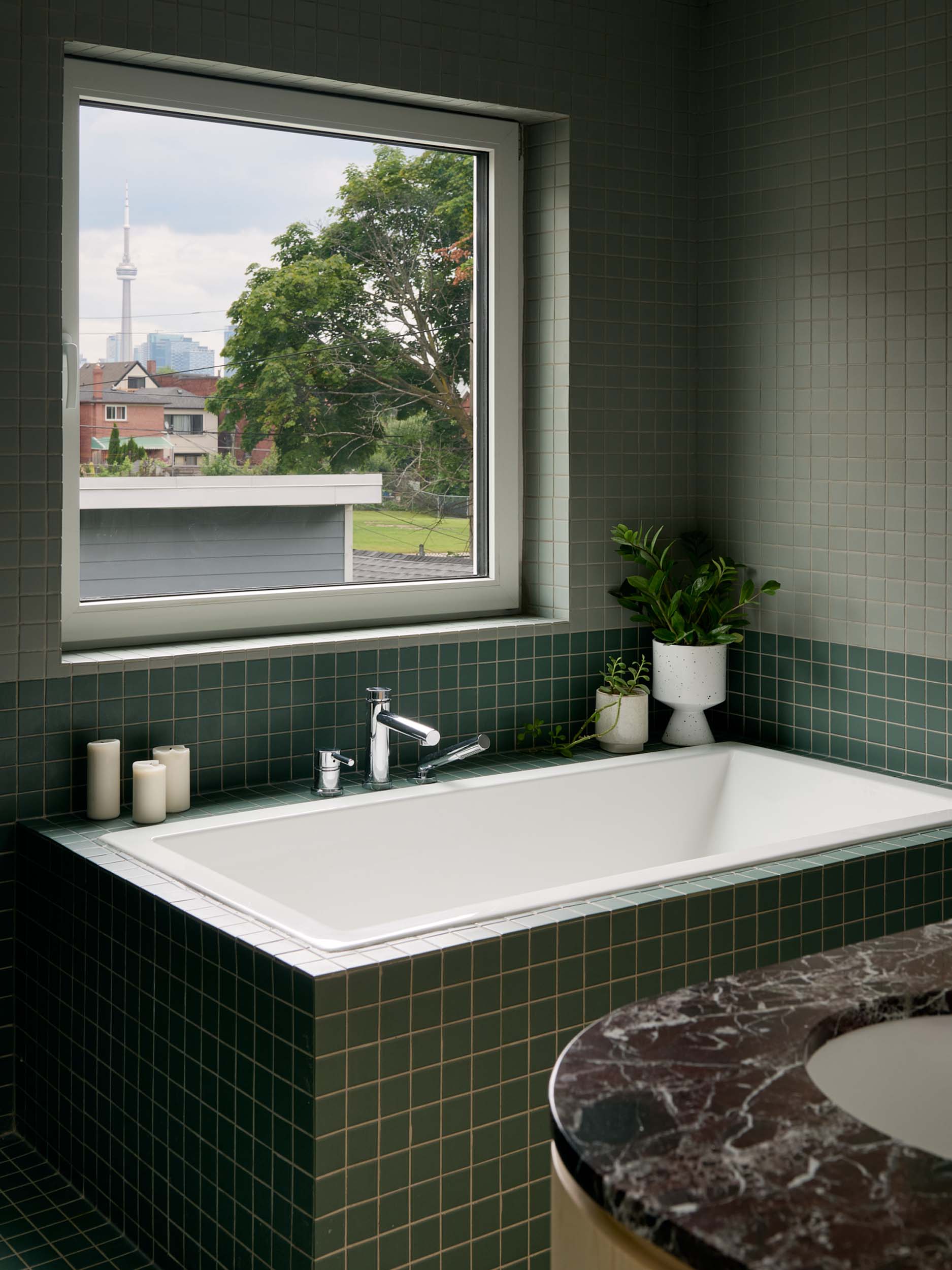
In the upstairs bathroom, soft greens are introduced again via tiles that encompass a deep soak tub. The inspiration for this space was derived from the cute family bathtub scene from the 1988 Hayao Miyazaki film, My Neighbor Tortoro.
Nik commented that with all of the bold colors with this project, he sometimes forgets that the revamped home is green in both senses of the word: visually and sustainable through using exclusively electronic appliances. “This is an aspect of the house which I even forget sometimes, because the visuals and the exterior is what attracts the most attention,” he said. “But this house was truly something special, for good people, wanting to do good in the world and wanting to do good with their home and how energy is spent.”