In Mexico City’s Colonia Narvarte, Drip Café offers specialty coffee out of an exposed industrial shell. Architects Matthew Kennedy and Ruy Berumen designed the space with respect to the neighborhood. Housed in a former well-known and loved lavandería, the new cafe reveals the building’s history as it makes way for a new offering. In response to a tight budget and meaningful site, the designers merge saved and exposed elements with new, modern components to craft a cafe specifically for its neighborhood.

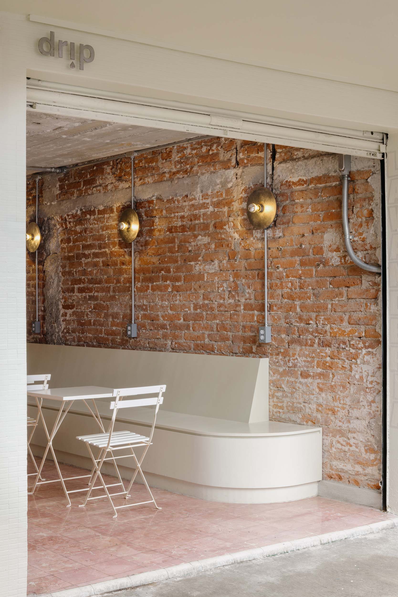
Located at Torres Adalid 1913, the nearly 425-square-foot cafe was cluttered with plumbing and an array of installations from its former site as a laundry facility. Before truly making the design decisions, Kennedy and Berumen first had to clean up the space to see what they were working with. “The strategy was to understand how the space could be adapted easily, feasible, and economically to the new location,” Berumen told AN Interior. After chipping off plaster and removing a layer of flooring, the designers chose on-site what to salvage. The orange-tinged bricks and underlying flooring made the cut.

“We had to kind of do this double operation,” continued Kennedy. “On the one hand, we needed to make the economics of the project work. On the other hand, we had to come up with a concept that felt nice while not alienating the people that lived in the neighborhood.” Preserving some of the building’s original elements not only helped the duo embrace the constraints of the project, but it also ensured the design considers the sentiments of the neighborhood. The entry still maintains the original lavandería signage which had been there for 30 years, now in new paint.


The rough and ready materiality looks even more excavated in the bathroom. Exposed brick seems to continue endlessly thanks to the mirrored surfaces. Originally the plan was to replace the chipped tile that dotted the vanity, but, as Kennedy explained, spontaneous changes happened on site. “The contractor was removing the few that were chipped, and we realized that they had left this really perfect imprint of the back of the tile, so perfect that you could read the little seal on the back,” he said. The discovery drove the design team to remove all the tiles and let the echo of the label be the vanity cladding.


After deciding what to keep, Kennedy and Berumen then determined what to add. To warm up the industrial elements, they looked to tiles and light hues. Creamy white tiles clad the counter, topped with stainless steel. White seating and banquettes brighten the space.

The cafe’s low ceilings and deep footprint restrict natural light to the front and rear of the interior, where the cafe flows into a back patio topped with a light well. The design team opened up the back with foliage in built-in planters and draped textiles after deft maneuvering. “The back patio was covered by a plastic corrugated roof during its time as a laundry facility, and one of the neighbors living above had done an informal construction which projected out over the light well,” said Kennedy. “That’s why there’s a ton of columns.”


To complement daylight, the duo also designed sconces for the space using metal plates that the contractors had as leftover, which is also why the plates are nearly 1/8-inch thick. The circular plates are fit with bulbs dipped in silvery material. “You see this in a lot of contemporary Mexican design that’s sort of taking its cues from an earlier moment of modern architecture,” explained Kennedy. The dip helps distribute light more evenly and softly instead of all from the front of the bulb. It casts an inviting glow across the space, uniting old and new.